This post proposes smoothing ROC curves to make them into objects that can be studied with calculus. It shows how taking derivatives of the ROC curve enables conducting likelihood ratio tests and explores how basic concepts from differential geometry, such as curvature and arc length, may be helpful in examining the behavior of ROC curves. Code is provided to illustrate the ideas presented, and some trouble is taken to examine the effects of smoothing.
Author
Joseph B. Rickert
Published
December 12, 2025
A common use of ROC (Receiver Operating Characteristic) curves in data science is to evaluate performance of binary classifiers. In this use case, the data set is usually a sample from a population and so the ROC curve itself is a random object. Although it is not common to have multiple sample ROC curves constructed from applying the same classifier to multiple sample data sets from the same population, it would be interesting to be able to construct a mean ROC curve from multiple sample ROC curves. One way to go about this would be to use the theory of functional data analysis (FDA) to construct curves from the sample points in such a way that the curves themselves become the random objects of study. The first step in the FDA process typically is to use splines to construct a set of basis functions to smooth the sample points into functional objects. In this post, I am going to explore this first step of smoothing ROC curves, and point out that once you have a smoothed ROC curve, it is possible to use calculus and concepts from basic differential geometry to analyze the curves. The flow of the post is as follows:
Select some data sets to analyze. (I am only going to work with one data set in this post, but I have set up the code so that you can choose between three available data sets if you want to explore on your own.)
Fit three different binary classifiers to the data set and compute the standard ROC curves and AUC values.
Use spline basis functions to smooth the ROC curves and compute AUC and arc length for the smoothed curves, and discuss some of the difficulties involved in smoothing ROC curves in a meaningful way.
Provide some basic analysis.
Show the packages required
library(tidymodels) # For modeling and evaluationlibrary(dplyr) # For data manipulationlibrary(ggplot2) # For plottinglibrary(MASS) # for Pima.trlibrary(mlbench) # for datalibrary(broom)library(pROC) # For ROC curve analysislibrary(patchwork) # for plot layoutslibrary(gt) # For tableslibrary(katex) # For rendering mathtidymodels_prefer()
The Data
Rather than only using synthetic data, I thought that the ideas in the post would make more of a positive impression if they were illustrated with small, familiar data sets. So in addition to the two_class_dat artificial data set from the modeldata package, I have included Pima.tr from the MASS package and the aSAH data set from the pROC package. I am going to use the aSAH2 data set, a subset of aSAH, in the rest of the post, but you can easily switch to one of the other two data sets by changing a single line of code. All three of these data sets contain three variables: two numeric features and a binary class label. I believe that these simple data sets are sufficient to provide a minimal viable demonstration of the issues I am going to discuss. Using simple data sets that conform to the same structure also makes it easy to fit multiple classification models with a single tidymodels workflow.
This next section of code prepares the data sets. The way of selecting which data set to use should be clear.
Look at the available data sets
# Load a sample dataset (e.g., `two_class_dat` from `modeldata`)data(two_class_dat, package ="modeldata")two_class_dat2 <- two_class_dat %>%mutate(Class =recode(Class,"Class1"="1","Class2"="2"))data(Pima.tr, package ="MASS")Pima.tr2 <- Pima.tr %>%mutate(Class = type,Class =recode(Class,"Yes"="2","No"="1" ) ) %>%select(c(bmi, bp, Class))data(aSAH, package ="pROC")aSAH2 <- aSAH %>%mutate(Class = outcome,Class =recode(Class,"Good"="1","Poor"="2" ) ) %>%select(c(s100b, ndka, Class))# Set a seed for reproducibilityset.seed(123)# SELECT A DATA SET TO USE HERE#df<- two_class_dat2 # try FPC = 1, FNC = 10#df <- Pima.tr2 # try FPC = 10 , FNC = 1df <- aSAH2 #try FPC = 1, FNC = 1head(df)
# Split the data into training and testing setsdata_split <-initial_split(df, prop =0.75, strata = Class)train_data <-training(data_split)test_data <-testing(data_split)
The Classifiers
The workflows use three classifiers to fit the models: Logistic Regression, SVM, and Decision Trees.
Show the workflow code
# Define the models# 1. Logistic Regressionlog_reg_spec <-logistic_reg() %>%set_engine("glm") %>%set_mode("classification")# 2. Support Vector Machine (SVM)svm_spec <-svm_linear() %>%set_engine("kernlab") %>%set_mode("classification")# 3. Decision Treetree_spec <-decision_tree() %>%set_engine("rpart") %>%set_mode("classification")# Create workflows for each modellog_reg_wf <-workflow() %>%add_model(log_reg_spec) %>%add_formula(Class ~ .)svm_wf <-workflow() %>%add_model(svm_spec) %>%add_formula(Class ~ .)tree_wf <-workflow() %>%add_model(tree_spec) %>%add_formula(Class ~ .)# Fit the models to the training datalog_reg_fit <-fit(log_reg_wf, data = train_data)svm_fit <-fit(svm_wf, data = train_data)
Setting default kernel parameters
Show the workflow code
tree_fit <-fit(tree_wf, data = train_data)# Collect predictions for each model on the test datalog_reg_preds <-predict(log_reg_fit, new_data = test_data, type ="prob") %>%bind_cols(test_data %>%select(Class)) %>%mutate(model ="Logistic Regression")svm_preds <-predict(svm_fit, new_data = test_data, type ="prob") %>%bind_cols(test_data %>%select(Class)) %>%mutate(model ="SVM")tree_preds <-predict(tree_fit, new_data = test_data, type ="prob") %>%bind_cols(test_data %>%select(Class)) %>%mutate(model ="Decision Tree")# Compute AUCs and relabel models with AUC valuesauc_tree <-roc_auc(tree_preds, truth = Class, .pred_1)$.estimateauc_svm <-roc_auc(svm_preds, truth = Class, .pred_1)$.estimateauc_log_reg <-roc_auc(log_reg_preds, truth = Class, .pred_1)$.estimate# Update model labels to include AUClog_reg_preds <- log_reg_preds %>%mutate(model =paste0("Logistic Regression (AUC = ", round(auc_log_reg, 3), ")"))svm_preds <- svm_preds %>%mutate(model =paste0("SVM (AUC = ", round(auc_svm, 3), ")"))tree_preds <- tree_preds %>%mutate(model =paste0("Decision Tree (AUC = ", round(auc_tree, 3), ")"))# Combine predictions with updated labelsall_preds <-bind_rows(log_reg_preds, svm_preds, tree_preds)
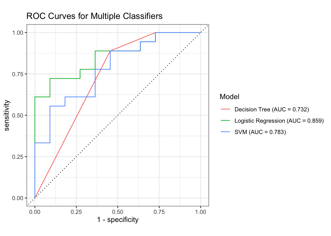
This section of code fits the models, computes AUC for each model, and plots the basic ROC curves.
Show Code
### Plot the ROC Curvesall_preds %>%group_by(model) %>%roc_curve(truth = Class, .pred_1) %>%autoplot() +labs(title ="ROC Curves for Multiple Classifiers",color ="Model" )
Show Code
# Make a copy of all_preds with cleaned model namesall_preds_2 <- all_preds %>%mutate(model_AUC = model,model =sub(" \\(AUC.*$", "", model_AUC) )# Compute ROC data for each modelroc_data <- all_preds_2 %>%group_by(model) %>%roc_curve(truth = Class, .pred_1)# Compute AUC for each modelauc_data <- all_preds_2 %>%group_by(model) %>%roc_auc(truth = Class, .pred_1)# Inspect actual model names#print(unique(roc_data$model))# Build legend labels with AUClegend_labels <-paste0( auc_data$model," (AUC = ", sprintf("%.3f", auc_data$.estimate), ")")# IMPORTANT: match colors to the actual values in your data# Replace the strings below with the exact output from unique(roc_data$model)color_values <-c("Logistic Regression"="#1b9e77","SVM"="#7570b3","Decision Tree"="#d95f02")# Ensure model is a factor with levels matching auc_data$modelroc_data <- roc_data %>%mutate(model =factor(model, levels = auc_data$model))
Smooth ROC Curves
In this section, a spline bases is used to construct smoothed curves. AUC is computed for both raw and smoothed ROC curves. Arc length is only computed for the smoothed curves. The major technical challenge in smoothing ROC curves is to ensure that the smoothed curves are monotone, non-decreasing in both TPR and FPR. I have addressed this issue by using the “monoH.FC” method in R’s splinefun function. This method, which constructs a monotone Hermite cubic spline using the Fritsch–Carlson method, was designed to minimize the creation of artifacts that could jeopardize monotonicity. It adjusts slopes at knots to prevent oscillations while keeping the interpolation smooth.
A second problem is that the smoothing process affects the TPR and FPR values in a way that can affect the AUC values. We will examine both of these issues below.
Show Code
df <- all_preds# Numerical integration using the trapezoidal ruletrapz <-function(x, y) {sum((y[-1] + y[-length(y)]) /2*diff(x))}# Compute discrete ROC points from predictionsdiscrete_roc <-function(df) { roc_obj <-roc(response = df$Class,predictor = df$.pred_1,levels =c("2", "1"), # control first, positive seconddirection ="<" ) rc <-coords(roc_obj, "all", ret =c("specificity", "sensitivity"), transpose =FALSE) FPR <-1- rc$specificity TPR <- rc$sensitivity FPR <-c(0, FPR, 1) TPR <-c(0, TPR, 1) ord <-order(FPR, TPR) FPR <- FPR[ord] TPR <-cummax(TPR[ord]) # enforce monotonicitytibble(FPR = FPR, TPR = TPR)}# smooth_roc takes raw ROC points (FPR, TPR) and produces a smoothed ROC curve with:# 1. a monotone spline interpolation of TPR vs. FPR#. 2. a dense grid of points (n = 400 by default)#. 3. Computes AUC (area under the curve)#. 4. Computes arc length (geometric length of the ROC trajectory)#. 5. Returns a tibble with the smoothed ROC coordinates and the two summary metrics. # # "monoH.FC" is a special option in R’s splinefun that stands for Monotone Hermite cubic spline# (Fritsch–Carlson method) that attempts to guarantee that the interpolated function is monotone increasing# if the data are monotone. Unlike ordinary cubic splines, which can overshoot and produce non‑monotone# artifacts, "monoH.FC" preserves the monotonicity of ROC curves (TPR should not decrease as FPR increases).# The algorithm adjusts slopes at knots to prevent oscillations while keeping the interpolation smooth.smooth_roc <-function(FPR, TPR, n =400) { df <-tibble(FPR = FPR, TPR = TPR) %>%arrange(FPR) %>%distinct(FPR, .keep_all =TRUE) mono_fun <-splinefun(x = df$FPR, y = df$TPR, method ="monoH.FC") x <-seq(0, 1, length.out = n) y <-pmin(pmax(mono_fun(x), 0), 1) auc <-trapz(x, y) dy <-mono_fun(x, deriv =1) arc <-trapz(x, sqrt(1+ dy^2))tibble(FPR = x, TPR = y, auc = auc, arc = arc)}# Normalize model namesdf <- df %>%mutate(model_norm =sub(" \\(.*$", "", model))smooth_results <- df %>%group_by(model_norm) %>%group_modify(~ { dr <-discrete_roc(.x) sr <-smooth_roc(dr$FPR, dr$TPR, n =400)# sr %>% mutate(model_norm = unique(.x$model_norm)) }) %>%ungroup()metrics <- smooth_results %>%group_by(model_norm) %>%summarise(AUC =unique(auc), Arc =unique(arc), .groups ="drop")
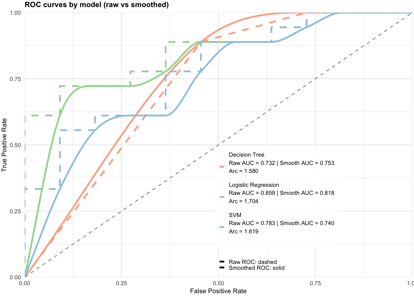
Here we plot the smoothed ROC curves for each of the three classifiers, overlaying them on the raw ROC curves. For each classifier, the legend includes AUC for both the raw and smoothed ROC curves, and arc length for the smoothed curves.
Show Code
# df_raw: columns .pred_1, .pred_2, Class, model# smooth_results: columns model_norm, FPR, TPR, auc, arc# 1) Normalize model names in the raw data so they match smooth_results$model_normdf_raw <- all_preds %>%mutate(model_norm =sub(" \\(.*$", "", model)) # e.g., "Logistic Regression (AUC = ...)" -> "Logistic Regression"# 2) Compute raw ROC coordinates and raw AUC per modelraw_results <- df_raw %>%group_by(model_norm) %>%group_map(~{ roc_obj <-roc(response = .x$Class,predictor = .x$.pred_1,levels =c("2","1"),direction ="<") rc <-coords(roc_obj, "all", ret =c("specificity","sensitivity"), transpose =FALSE) FPR <-1- rc$specificity TPR <- rc$sensitivity# pad ends, order, enforce monotone TPR FPR <-c(0, FPR, 1) TPR <-c(0, TPR, 1) ord <-order(FPR, TPR) FPR <- FPR[ord] TPR <-cummax(TPR[ord]) auc_raw <-as.numeric(auc(roc_obj)) m <- .y$model_norm[[1]] # group label; safer than looking back into .xtibble(model_norm =rep(m, length(FPR)),FPR = FPR,TPR = TPR,auc_raw =rep(auc_raw, length(FPR)),curve_type =rep("raw", length(FPR)) ) }) %>%bind_rows()# 3) Prepare smoothed results to match columns (add curve_type and placeholder auc_raw)smooth_results_plot <- smooth_results %>%mutate(curve_type ="smooth",auc_raw =NA_real_# placeholder so bind_rows columns align )# 4) Combine raw + smooth resultsroc_results <-bind_rows(raw_results, smooth_results_plot)# 5) Build legend metrics: Raw AUC (from raw_results), Smooth AUC and Arc (from smooth_results)metrics_raw <- raw_results %>%distinct(model_norm, auc_raw) %>%rename(AUC_raw = auc_raw)metrics_smooth <- smooth_results %>%distinct(model_norm, auc, arc) %>%rename(AUC_smooth = auc, Arc = arc)metrics <- metrics_raw %>%left_join(metrics_smooth, by ="model_norm")legend_labels <-setNames(paste0(metrics$model_norm,"\nRaw AUC = ", sprintf("%.3f", metrics$AUC_raw),"\nSmooth AUC = ", sprintf("%.3f", metrics$AUC_smooth),"\nArc = ", sprintf("%.3f", metrics$Arc)), metrics$model_norm)# 6) Pastel colors (keep model association). Ensure names match smooth_results$model_norm exactly.color_values <-c("Decision Tree"="#fcae91", # pastel red"Logistic Regression"="#a1d99b", # pastel green"SVM"="#9ecae1"# pastel blue)legend_labels <-setNames(paste0(metrics$model_norm,"\nRaw AUC = ", sprintf("%.3f", metrics$AUC_raw)," | Smooth AUC = ", sprintf("%.3f", metrics$AUC_smooth),"\nArc = ", sprintf("%.3f", metrics$Arc),"\n"), # blank line between models metrics$model_norm)ggplot(roc_results, aes(x=FPR, y=TPR,color=model_norm,linetype=curve_type)) +geom_line(linewidth=1) +geom_abline(slope=1, intercept=0,linetype="dashed", color="grey60") +scale_color_manual(values=color_values, labels=legend_labels) +scale_linetype_manual(values =c("raw"="dashed", "smooth"="solid"),labels =c("raw"="Raw ROC: dashed", "smooth"="Smoothed ROC: solid") ) +scale_x_continuous(limits=c(0,1), expand=c(0,0)) +scale_y_continuous(limits=c(0,1), expand=c(0,0)) +labs(title="ROC curves by model (raw vs smoothed)",x="False Positive Rate",y="True Positive Rate",color=NULL, linetype=NULL) +guides(color =guide_legend(order =1, title =NULL, label.theme =element_text(size =7)),linetype =guide_legend(order =2, title =NULL, label.theme =element_text(size =7)) ) +theme_minimal(base_size=10) +theme(plot.title =element_text(size=9, face="bold"),axis.title =element_text(size=8),axis.text =element_text(size=7),legend.position =c(0.65, 0.25), # inside plot, under diagonallegend.text =element_text(size=7, lineheight=1.2),legend.background =element_rect(fill =alpha("white", 0.8), color =NA),legend.key.size =unit(0.5, "lines"),plot.margin =margin(2, 2, 2, 2) )
The first thing to observe is that the smooth curves do not perfectly overlay the stair-step, raw curves, as one might expect for curves with large steps. Nevertheless, the smooth curve AUC numbers are close to the raw curve numbers. Whether they are close enough depends on the application. My intuition is that as the number of data points used to construct the raw curves increases, the smoothed curves will better fit the raw curves and the AUC values will be closer. Also, note that selecting the curves based on arc length would lead to the same results.
The following code, which looks at adjacent differences in the smoothed ROC curves, flags monotonicity violations for Logistic Regression TPR.
Looking further into these violations for the Logistic Regression models shows that there are on the order of \(10^{-5}\), essentially numerical noise.
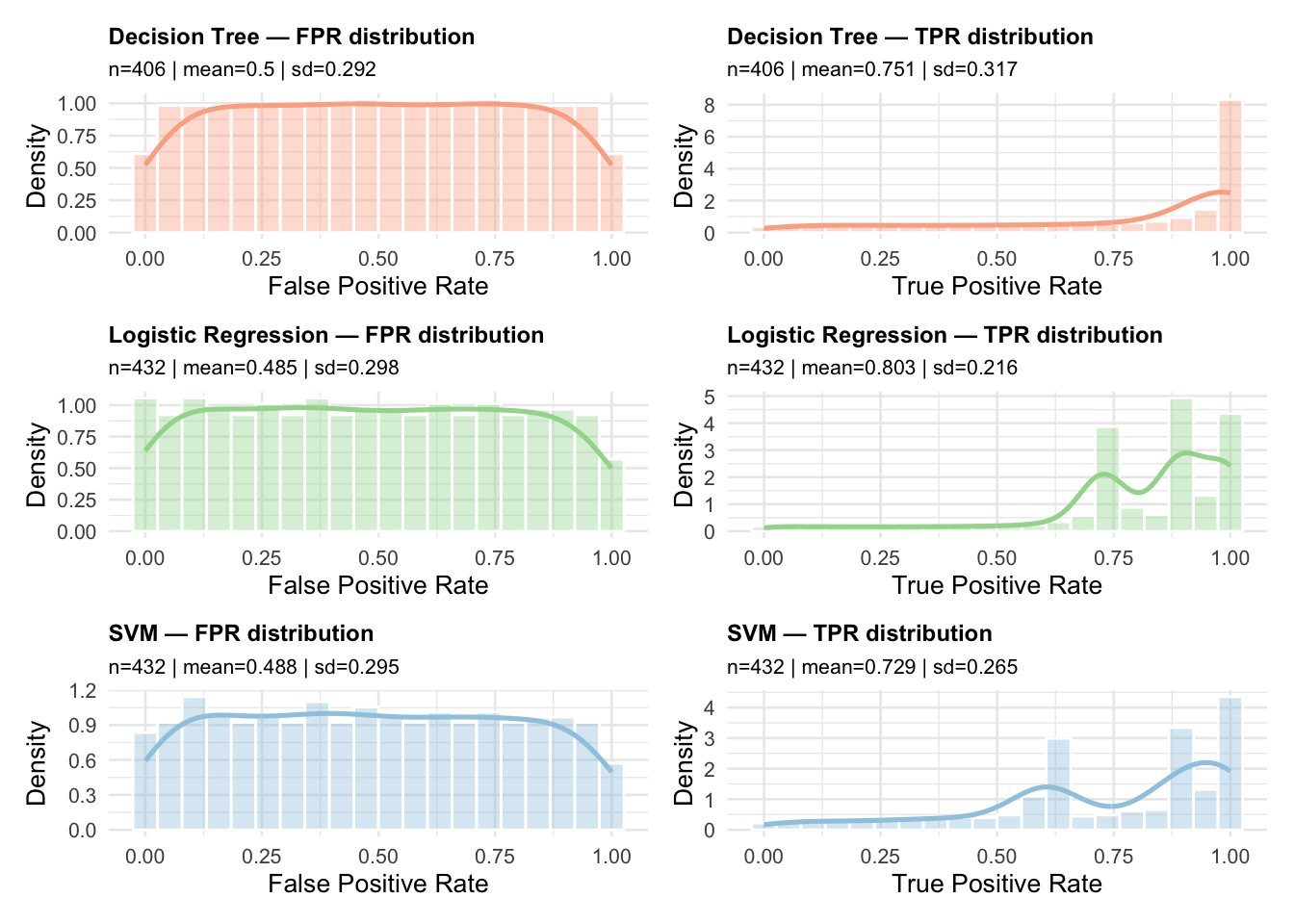
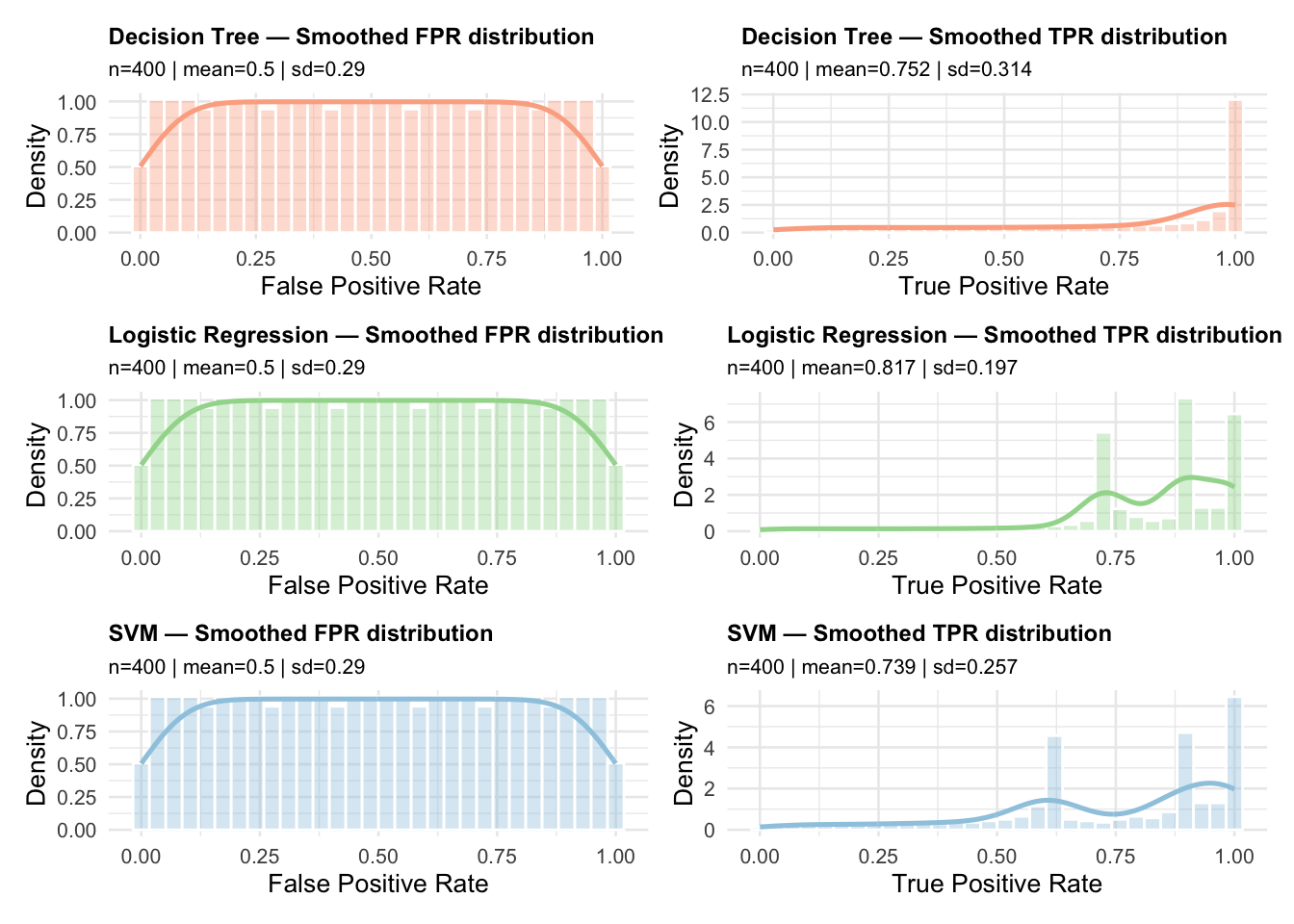
As was mentioned above, the smoothing process slightly changes the FPR and TPR values because they are now calculated with respect to the dense grid to perform smoothing. To get a feel for how this process may affect the FPR and TPR values, we plot the distributions of TPR and FPR for both the raw and smoothed ROC curves. This next plot shows the distributions for the raw ROC curves.
They look to be pretty close. How close could be quantified, but again, are they close enough would depend on the application.
A Little Calculus with ROC curves
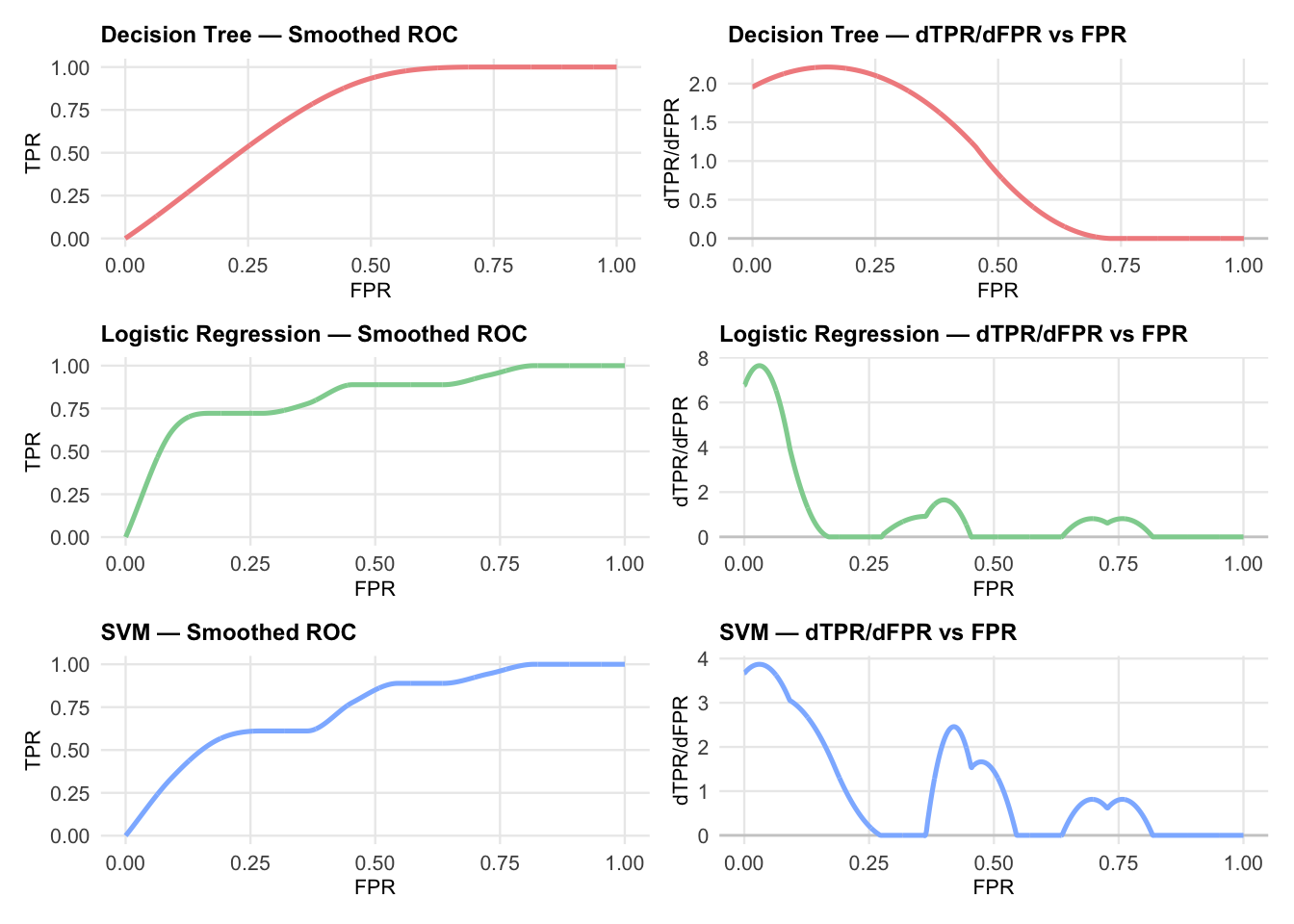
In this section, we examine what we can do using a little calculus on the smoothed ROC curves. We begin by computing some derivatives. This next plot shows the ROC curves for the three classifiers in the left column and the corresponding derivative of TPR with respect to FPR, \(d(TPR) / d(FPR)\) in the right-hand column.
Show the code for computing slope
# --- Palette: pastel per model ---model_colors <-c("Decision Tree"="#F28E8E", # pastel red"Logistic Regression"="#8FD19E", # pastel green"SVM"="#8EB8FF"# pastel blue)# --- Clean ROC per group: sort, drop duplicate FPR, enforce monotone TPR ---clean_roc <-function(df) { df %>%arrange(FPR) %>%distinct(FPR, .keep_all =TRUE) %>%mutate(FPR =pmin(pmax(FPR, 0), 1),TPR =pmin(pmax(cummax(TPR), 0), 1) )}# The goal of make_spline and compute_roc_geometry is to build a spline representation of the ROC curve # that allows derivatives (first and second) to be computed easily.# splinefun(..., method = "natural") — uses natural cubic splines which are smoother and differentiable up to second order.# note that "monoH.FC" splines guarantee monotonicity but can sometimes produce derivative discontinuities or numerical # instability in higher higher‑order derivatives.# The output is a tibble with columns FPR, TPR, dTPR (first derivative), and d2TPR (second derivative) evaluated on a uniform grid of FPR values from 0 to 1.# Use case: When you need geometry (curvature, slope, phase space analysis) rather than just smoothed ROC points# --- Spline builder (use "natural" to avoid strict monotonicity errors) ---make_spline <-function(df) { df <-clean_roc(df)splinefun(x = df$FPR, y = df$TPR, method ="natural")}# --- Geometry over a uniform grid: y, y', y'' ---compute_roc_geometry <-function(df, n_grid =1001) { f <-make_spline(df) xg <-seq(0, 1, length.out = n_grid) yg <-f(xg, deriv =0) y1g <-f(xg, deriv =1) y2g <-f(xg, deriv =2)tibble(FPR = xg, TPR = yg, dTPR = y1g, d2TPR = y2g)}# --- Plotters with small text and single-color line per model ---plot_roc <-function(geom_df, model_label, color_hex) {ggplot(geom_df, aes(x = FPR, y = TPR)) +geom_line(color = color_hex, linewidth =0.9) +labs(title =paste(model_label, "— Smoothed ROC"),x ="FPR",y ="TPR" ) +coord_cartesian(xlim =c(0, 1), ylim =c(0, 1)) +theme_minimal(base_size =9) +theme(plot.title =element_text(face ="bold", size =9),axis.title =element_text(size =8),axis.text =element_text(size =8),panel.grid.minor =element_blank() )}plot_derivative <-function(geom_df, model_label, color_hex) {ggplot(geom_df, aes(x = FPR, y = dTPR)) +geom_hline(yintercept =0, color ="grey80") +geom_line(color = color_hex, linewidth =0.9) +labs(title =paste(model_label, "— dTPR/dFPR vs FPR"),x ="FPR",y ="dTPR/dFPR" ) +coord_cartesian(xlim =c(0, 1)) +theme_minimal(base_size =9) +theme(plot.title =element_text(face ="bold", size =9),axis.title =element_text(size =8),axis.text =element_text(size =8),panel.grid.minor =element_blank() )}# --- Main: build 3x2 grid with ROC on the LEFT, derivative on the RIGHT ---plot_roc_geometry_grid <-function(smooth_results, n_grid =1001) {# Ensure intended order of rows model_order <-c("Decision Tree", "Logistic Regression", "SVM") models <-intersect(model_order, unique(smooth_results$model_norm))stopifnot(length(models) >0) rows <-map(models, function(m) { df <- smooth_results %>%filter(model_norm == m) geom_df <-compute_roc_geometry(df, n_grid) col_hex <- model_colors[[m]] p_left <-plot_roc(geom_df, m, col_hex) p_right <-plot_derivative(geom_df, m, col_hex) p_left | p_right })# Stack rows into 3x2 (or as many as available)reduce(rows, `/`)}# --- Usage ---# smooth_results must have columns: model_norm, FPR, TPRgrid_plot <-plot_roc_geometry_grid(smooth_results, n_grid =2001)print(grid_plot)
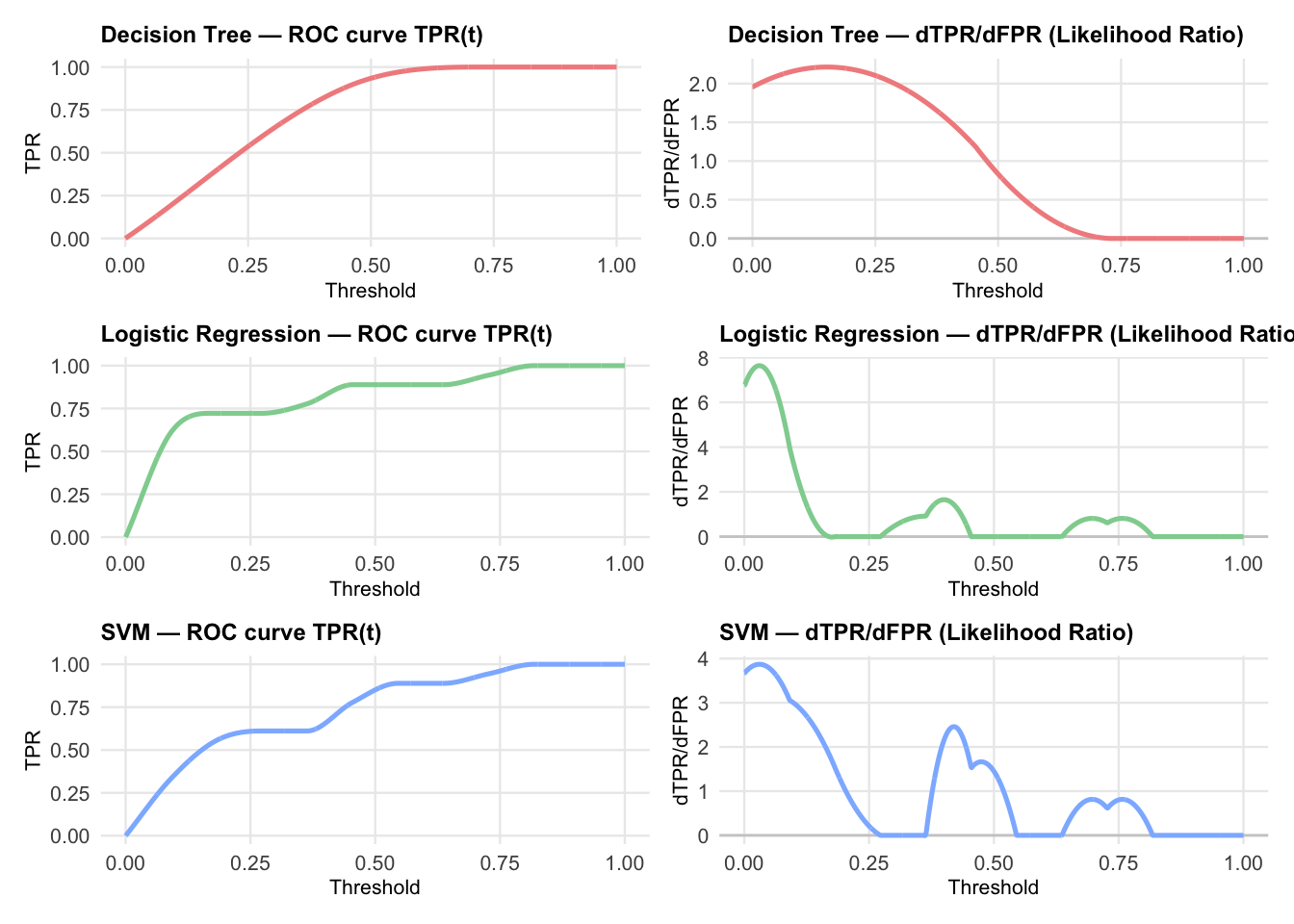
It a well known result from mathematical statistics, not usually emphasized in a machine learning context, that the slope of the tangent to the ROC curve at any point is equal to the the instantaneous likelihood ratio at that point. Choi (1998). This is exactly what is plotted in the second column. However, to understand the connection with differential geometry, the following section of code re-derives the plot by considering ROC curves parameterized by threshold \(t \in [0,1]\). The curve is expressed as the set of points \((FPR(t),TPR(t))\). This point of view is preferred for analyzing likelihood ratios and connecting with diagnostic test theory. In both cases, the likelihood ratio is identical since likelihood is a property of the curve and \(\frac{d(TPR)}{d(FPR)} = \frac{d(TPR)/dt))}{d(FPR)/dt}\).
The plot above shows the Likelihood ratios as a function of threshold for each of the three models. These values are stored in slope_DTPR_dFPR column of the derivative_df data frame. The following code extracts the maximum positive likelihood ratio and minimum negative likelihood ratio for each model. It follows Choi (1998), where he suggests comparing LR values to decision thresholds that are convenient for diagnostic testing:
LR+ (positive test): slope of the operating point where TPR is high and FPR is low (upper left of ROC curve)
LR- negative test: slope of the operating point where TPR is low and FPR is high (lower right of ROC curve)
# A tibble: 3 × 3
  model               max_LR_plus min_LR_minus
  <chr>                     <dbl>        <dbl>
1 Decision Tree              2.21   -0.0000530
2 Logistic Regression        7.64   -0.0203
3 SVM                        3.87   -0.00814
A standard interpretation for a diagnostic test is that LR+ values above 10 are considered strong evidence to rule in a condition while LR- values below 0.1 are considered strong evidence to rule out a condition.
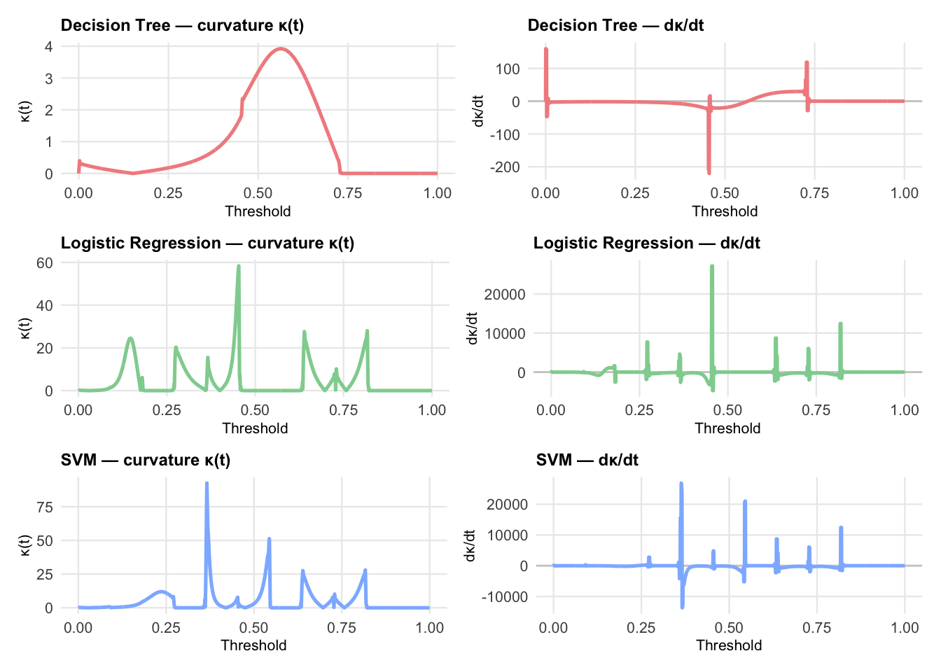
Curvature
We continue exploring ROC curves with ideas from elementary differential geometry. As was noted above, a smoothed ROC curve is a two-dimensional planar curve parameterized by threshold \(t\) which also directly represents the relationship between TPR and FPR. Each point (x,y) on the ROC curve yields the conditional distribution of TPR given the distribution of FPR, \(P(TPR \le y \mid FPR \le x)\).
Curvature, \(\kappa(x) = \frac{|y''(x)|}{\left(1 + \left[y'(x)\right]^2\right)^{3/2}}\) of a two-dimensional planar curve, measures how sharply the curve bends at a given threshold, \(t\). High values of curvature imply a rapidly changing slope, while low curvature indicates that the slope is changing slowly.
So curvature and its derivative with respect to threshold may be helpful in selecting threshold values for a particular application. Large positive values of \(d\kappa(t)/dt\) can indicate threshold zone where small changes in the decision rule can produce large changes in discrimination. Large negative values of \(d\kappa(t)/dt\) can indicate zones where slope changes are stabilizing, suggesting diminishing returns for tightening or loosening the decision rules. Zones with values near zero indicate regions that are relatively stable with respect to the threshold. The following code calculates \(\kappa(t)\) and \(d\kappa(t)/dt\) for each of the three models and plots them side by side.
The first thing that you may notice about the plots is that the curvature for the decision trees model looks smooth and stable. This is to be expected because the ROC curve for decision trees is piece wise linear with a small number of segments. The curvature is zero everywhere except at the corners, where it is undefined. The smoothing spline used here smooths out the corners, producing a smooth curve with small curvature values.
The areas around threshold values \(t=0.5\) appear to behave differently for the Logistic Regression and SVM models. However, it is not clear that these differences would make any practical difference in selecting thresholds for these models.
Using curvature in ROC studies is a relatively new idea, and it does not appear to be well studied. However, evaluating the curvature of ROC curves seems to be an idea that holds some promise. In their 2022 paper, Defining the extent of gene function using ROC curvature, Fischer and Gillis introduce the curvature of ROC curves as a method to evaluate gene function prediction. They write: > We identify Functional Equivalence Classes (FECs), subsets of annotated and unannotated genes that jointly drive performance, by assessing the presence of straight lines in ROC curves built from gene-centric prediction tasks, such as function or interaction predictions.
The Case for Arc Length
Finally, I would like to make a case for using the arc length \(\int_0^t \sqrt{1+(f'(x))^2}\,dx\) of a smoothed ROC curve as a metric for comparing classifiers that appears to be consistent and complementary to AUC. Arc length is not a useful concept for raw, stair-step ROC curves. Any stair-step curve that goes from (0,0) to (1,1) will have the same arc length of 2.0. However, the arc length for a viable smoothed ROC curve will range from \(\sqrt2\) to 2, and may be a useful metric for smoothed ROC curves because it captures information about the geometry of the curve that AUC does not.
Arc length is more sensitive to the shape of the ROC curve than AUC. Two ROC curves with identical AUC values can have very different shapes and therefore very different arc lengths. Arc length captures information about the slope changes, curvature, and smoothness of the ROC curve that AUC does not. This could be important in applications where the shape of the ROC curve is relevant to decision-making. For example, because the trajectory of most viable ROC curves will stay well above the diagonal from (0,0) to (1,1), arc length mostly avoids the criticism of AUC that led to the development of Partial Arc length. It is relatively easy to exclude segments of regions that are not important to the application. And, unless the ROC curve pathologically crosses the diagonal below FPR = 0 .5 it will not enter the region of low sensitivity and low specificity.
It is also the case that arc length is a linear measure while AUC is an area. I may very well be wrong about this, but I think most people have a better intuition of the practical significance of a linear difference of 0.3 inches than an area difference of 0.3 square inches. The following table contrasts AUC and arc length.
Table Comparing Arclength with AUC
Show the code to build the table
# --- Data for table ---tbl_data <-tribble(~Aspect, ~AUC, ~ArcLength,"Definition","$\\int_0^1 f(x)\\,dx$","$\\int_0^t \\sqrt{1+(f'(x))^2}\\,dx$","Bounds","0.5 (random) to 1.0 (perfect)","$\\sqrt{2} \\approx 1.414$ (diagonal) to 2.0 (perfect staircase ROC)","Interpretability","Widely used, intuitive for clinicians; benchmarks exist (e.g., >0.9 = excellent)","Linear measure, easier to visualize by eye; highlights curve geometry and trajectory","Sensitivity to curve shape","Less sensitive — curves with different shapes can yield similar AUC","More sensitive — captures slope changes, curvature, and smoothness differences","Partial evaluation","Partial AUC requires normalization; less visually obvious","It is easy to avoid problematic regions for most reasonable ROC curves","Noise robustness","Relatively robust; integrates over curve","More sensitive to noise or jaggedness; small oscillations inflate length","Clinical adoption","Standard metric with established thresholds","Novel metric; not yet widely adopted, requires new benchmarks","Use cases","Ranking accuracy, overall discrimination power","Diagnostic trajectory, geometric comparison, highlighting regional performance differences")gt_tbl <- tbl_data %>%gt() %>%tab_header(title ="Comparison of ROC Metrics: AUC vs. Arc Length") %>%cols_label(Aspect ="Aspect",AUC ="AUC (Area Under Curve)",ArcLength ="Arc Length (ROC Curve Length)" ) %>%fmt_markdown(columns =everything()) %>%tab_options(table.font.size =px(12), # smaller textdata_row.padding =px(2) # tighter row spacing )gt_tbl
ROC curves, fundamental tools in evaluating binary classifiers, are naturally expressed as parameterized curves. However, especially for small samples, the raw ROC curves are stair-step functions that are not differentiable. Smoothing techniques, such as cubic splines, can produce smooth ROC curves that are differentiable and amenable to analysis beyond computing the area under the curve (AUC). Moreover, ideas from elementary differential geometry, such as curvature and arc length, may provide additional insights into the performance and behavior of classifiers that are not captured by AUC alone.
Appendix: Equations for Derivatives
Derivatives of equations expressed in (x,y) coordinates