library(tidyverse)
library(palmerpenguins)

# Compute
penguins_medians <- penguins |>
  summarize(bill_length_mm_median = median(bill_length_mm, na.rm = TRUE),
bill_depth_mm_median = median(bill_depth_mm, na.rm = TRUE))If you use ggplot2, you are probably used to creating plots with geom_line() and geom_point(). You may also have ventured into to the broader ggplot2 ecosystem to use geoms like geom_density_ridges() from ggridges or geom_signif() from ggsignif. But have you ever wondered how these extensions were created? Where did the authors figure out how to create a new geom? And, if the plot of your dreams doesn’t exist, how would you make your own?
Enter the exciting world of creating your own ggplot2 extensions.
I had the pleasure of meeting Gina Reynolds when I first began my job at Posit (then RStudio) and she was contributing a blog post on flipbookr. Since then, we’ve kept in touch through the ggextenders extension club. Every few months, the club meets virtually to hear from a ggextender (someone who works with ggplot2 extensions). The speaker can talk about a custom geom they’ve created for the community or more general R visualization topics. Each presentation is insightful and interesting. I’ve had the opportunity to learn about cool packages like ggstats. Join us sometime by filling out this questionnaire!
However, I was never a “ggextender” myself (having just used and never developed extenders). I found the idea of creating an extension daunting. That is, until recently!
Gina held a focus group that worked through the Easy geom recipes, a series of tutorials on creating ggplot2 extensions. Following “recipes”, you methodically create three extensions. Each time, certain key knowledge points are reinforced and new variations are introduced.
So, say we want to create a new geom_*() that adds a point on the median of the x-axis and y-axis variables of a plot. We will call it geom_medians(). Let’s follow the recipe:
Step 0. Get the job done with ‘base’ ggplot2.
First, clarify what needs to happen without getting into the extension architecture. Load the tidyverse package and the palmerpenguins package.
Calculate the median of the x variable (bill_length_mm) and y variable (bill_depth_mm) as you would normally.
Now, use base ggplot2 to get the job done.
This requires specifying bill_depth_mm_median and bill_length_mm_median, which we just created, within aes() in geom_point().
This is the resulting plot.
Step 1: Define Compute and test.
Define the compute that will transform your input data “under the hood” before rendering it.
Next, test the compute to make sure that the output matches what you expect. Note that the names x and y are required.
Step 2: Define new Stat. Test.
Next, use the ggplot2::ggproto() function, which creates a new Stat function that does computation under the hood when building a plot. Don’t worry, you don’t have to write this yourself. This is provided as boilerplate code, all you have to do is edit the relevant code!
Test your new Stat by using it in a geom_*() function.
Step 3: Define user-facing functions. Test.
Now, define the user-facing function. This is more boilerplate code that you edit depending on what you are creating.
The stat_*() function name derives from the Stat objects’s name, but is snake case.
“Point” is specified as the default for the geom argument in the function. This means that the ggplot2::geom_point() will be used in the layer unless otherwise specified by the user.
StatMedians defines the new layer function, so summarizing the medians will be in play before the layer is rendered.
Alternatively, the new make_constructor() function, available in ggplot2 v4.0.0, will write much of the above boilerplate code for you.
And because users are more accustomed to using layers that have the ‘geom’ prefix, you might also define geom with almost identical properties using make_constructor().The difference between stat_medians and geom_medians is that the stat is fixed in the former, and the geom is fixed in the latter.
Now, test your user-facing function by using it in a ggplot2 plot.
# Plot
penguins |>
  ggplot() +
  aes(x = bill_depth_mm, y = bill_length_mm) +
  geom_point() +
  geom_point(data = penguins_medians,
             aes(x = bill_depth_mm_median,
                 y = bill_length_mm_median),
             size = 8, color = "red") +
  labs(title = "Created with base ggplot2")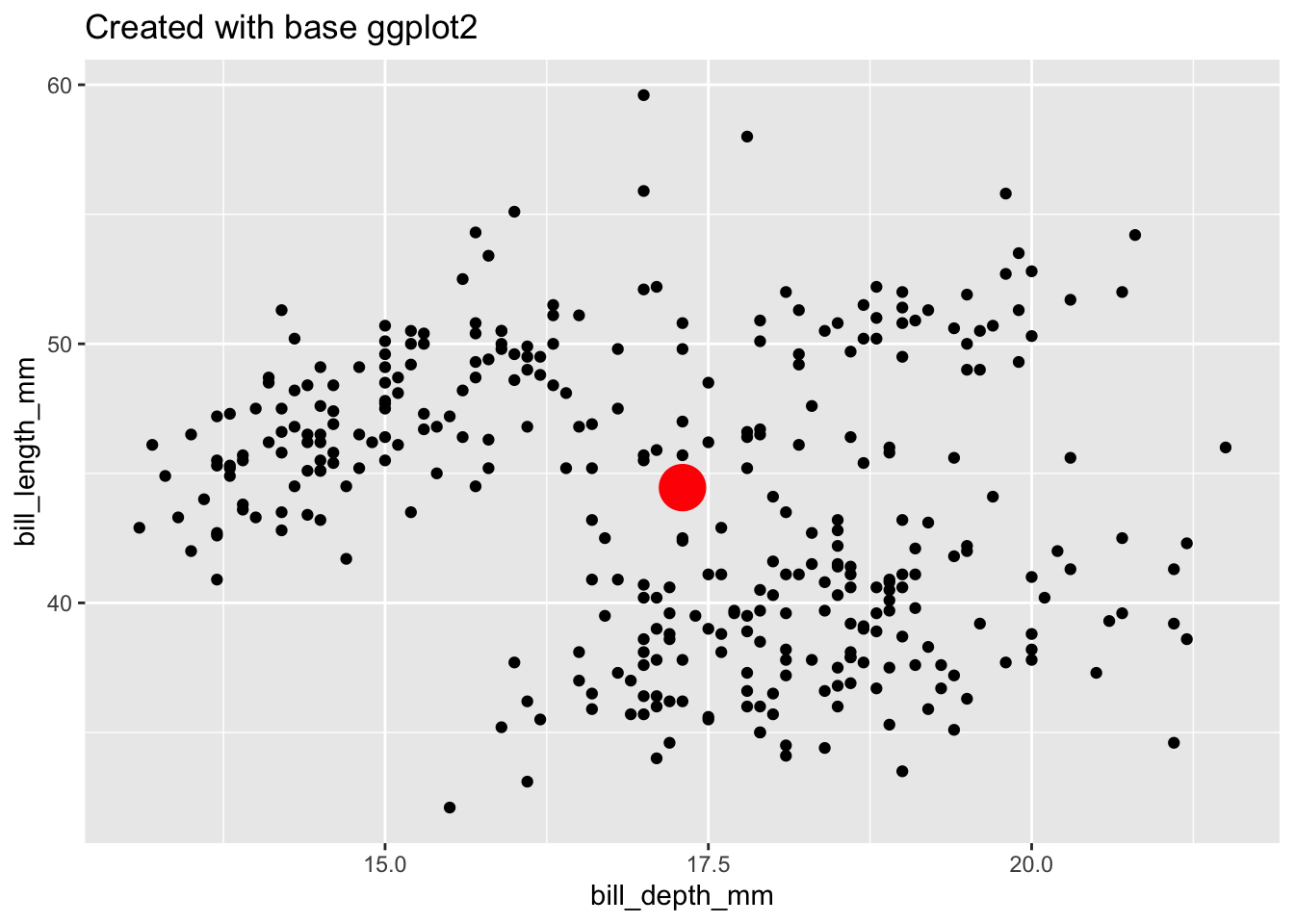
# Define compute.
compute_group_medians <- function(data, scales){
  data |>
    summarize(x = median(x, na.rm = T),
              y = median(y, na.rm = T))
}
# Test compute.
penguins |>
select(x = bill_depth_mm,
y = bill_length_mm) |>
compute_group_medians()# A tibble: 1 × 2
x y
<dbl> <dbl>
1 17.3 44.4StatMedians <-
ggplot2::ggproto(
`_class` = "StatMedians",
`_inherit` = ggplot2::Stat,
compute_group = compute_group_medians,
required_aes = c("x", "y")
)penguins |>
ggplot() +
aes(x = bill_depth_mm,
y = bill_length_mm) +
geom_point() +
geom_point(stat = StatMedians, size = 7) +
labs(title = "Testing StatMedians")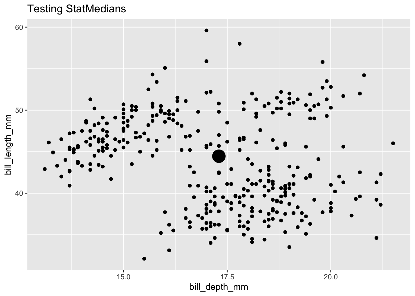
stat_medians <-
  function(mapping = NULL, data = NULL,
           geom = "point", position = "identity",
           ..., show.legend = NA, inherit.aes = TRUE)
    {
    layer(data = data, mapping = mapping, stat = StatMedians,
          geom = geom, position = position, show.legend = show.legend,
          inherit.aes = inherit.aes, params = rlang::list2(na.rm = FALSE,
                                                           ...))
    }
stat_medians <- make_constructor(StatMedians, geom = "point")
## check the new function's specification
print(stat_medians)function (mapping = NULL, data = NULL, geom = "point", position = "identity",
..., na.rm = FALSE, show.legend = NA, inherit.aes = TRUE)
{
layer(mapping = mapping, data = data, geom = geom, stat = "medians",
position = position, show.legend = show.legend, inherit.aes = inherit.aes,
params = list2(na.rm = na.rm, ...))
}
<environment: 0x11ff6daf8>geom_medians <- make_constructor(GeomPoint, stat = "medians")
## check the new function's specification
print(geom_medians)function (mapping = NULL, data = NULL, stat = "medians", position = "identity",
..., na.rm = FALSE, show.legend = NA, inherit.aes = TRUE)
{
layer(mapping = mapping, data = data, geom = "point", stat = stat,
position = position, show.legend = show.legend, inherit.aes = inherit.aes,
params = list2(na.rm = na.rm, ...))
}
<environment: 0x128266630>## Test user-facing.
penguins |>
ggplot() +
aes(x = bill_depth_mm, y = bill_length_mm) +
geom_point() +
geom_medians(size = 8) +
labs(title = "Testing geom_medians()")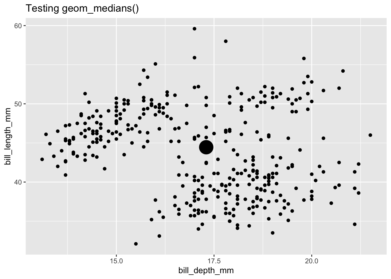
And then you’re done! You’ve created your first ggplot extension 🥳.
Going through the recipes is a great way to ease into your ggplot2 extension journey. They offer three well-crafted examples with a clear structure and sequence of steps. The boilerplate code looks daunting, but you can copy/paste it and edit it depending on what you are creating; if you want to go into more detail as to what it’s actually doing, the tutorials provide additional resources. A fun note is that the geom recipes website uses webR and Quarto Live to embed interactive code chunks directly in the tutorial. It makes for an immersive experience while going through the exercises.
Want to try your own hand at creating geom_means()? Go through the interactive tutorial in Easy geom recipes!
Resources
It’s a delight going through Gina’s resources, from seeing the adorable ggextenders hex to reading all the touching notes about ggplot2, comparing it to art, food, poetry, and more. It’s a testament to how a tool can inspire so many. Here are some of my favorites quotations and metaphors:
- “ggplot2 lets users ‘speak their plots into existence’” — Thomas Lin Pedersen
- “You are a composer of ‘graphical poems’” — Hadley Wickham
Learn more about Gina’s work here:
- ggplot2 extenders club website: See previous talks and sign up for future webinars
- Everyday ggplot2 extension: Education materials for potential extenders
- ggplot2 extension cookbook: Guide that presents extension strategies in a consistent and accessible way
- Easy geom recipes: A series of tutorials on creating a tutorial
There is a comprehensive list of resources on the ggplot2 extenders club website.
Many thanks to Andrew Bray, James Goldie, and the QMD Lab for Closeread, a Quarto extension for scrollytelling, which walked through the ggextender steps, and Gina, for both organizing the ggplot2 extenders club and reviewing this post!