%%| label: fig-risk-network
%%| fig-cap: "Data Center Risk Network"
%%| fig-alt: "Directed network showing data-center impacts and risks leading to overall community risk."


flowchart LR

  Scale --> LandFootprint
  Scale --> ElectricityDemand
  Scale --> WaterDemand
  Scale --> ConstructionIntensity
  Scale --> BackupGeneration
  Scale --> WorkforceDemand
  Scale --> NoiseExposure
  Scale --> AirQualityExposure
  Scale --> AccessToBenefits
  Scale --> EconomicBenefit

  Cooling --> WaterDemand
  Cooling --> NoiseExposure

  Distance --> NoiseExposure
  Distance --> AirQualityExposure
  Distance --> TrafficExposure
  Distance --> VisualLandUseExposure
  Distance --> AccessToBenefits
  Distance --> ElectricityCostRisk

  LandFootprint --> VisualLandUseExposure
  ConstructionIntensity --> TrafficExposure
  BackupGeneration --> AirQualityExposure

  ElectricityDemand --> GridStress
  GridCapacity --> GridStress
  GridStress --> ElectricityCostRisk
  GridStress --> ReliabilityRisk

  WaterDemand --> WaterCompetition
  WaterAvailability --> WaterCompetition
  WaterCompetition --> WaterSecurityRisk
  Vulnerability --> WaterSecurityRisk

  WorkforceDemand --> HousingPressure
  HousingAvailability --> HousingPressure
  WorkforceDemand --> ServicePressure
  HousingAvailability --> ServicePressure

  LandFootprint --> EnvironmentalDegradation
  WaterDemand --> EnvironmentalDegradation
  WaterAvailability --> EnvironmentalDegradation

  NoiseExposure --> QualityOfLifeRisk
  AirQualityExposure --> QualityOfLifeRisk
  TrafficExposure --> QualityOfLifeRisk
  VisualLandUseExposure --> QualityOfLifeRisk
  HousingPressure --> QualityOfLifeRisk
  Vulnerability --> QualityOfLifeRisk

  AccessToBenefits --> EconomicBenefit

  QualityOfLifeRisk --> OverallCommunityRisk
  WaterSecurityRisk --> OverallCommunityRisk
  ElectricityCostRisk --> OverallCommunityRisk
  ReliabilityRisk --> OverallCommunityRisk
  EnvironmentalDegradation --> OverallCommunityRisk
  HousingPressure --> OverallCommunityRisk
  ServicePressure --> OverallCommunityRisk
  EconomicBenefit --> OverallCommunityRisk
Data centers required to fuel the ambitions of Artificial Intelligence companies have sparked a nationwide conversation. AI companies are moving quickly to build out infrastructure and local communities are pushing back to resist what they see as the appropriation of public resources such as electricity and water to further enrich wealthy corporations. Moreover, the sentiment shared by both the political left and right is that data centers will significantly degrade the quality of life for those living adjacent to a data center and to the extended community as well. This post implements a non-trivial Bayesian Network to study the risks involved. I hope it is of some interest to a broad audience including, people interested in clarifying their thoughts about the risks that data centers may pose to their particular community and analysts curious about Bayesian Networks. However, I think the sample model built out in this post will be especially interesting to decision analysts who know quite a bit about Bayesian Networks but may be unfamiliar with the R programming language and unaware that there is capable opensource software which can provide capabilities beyond those offered by proprietary software systems.
Other than addressing the topic of data center risks the analysis contains no original research except perhaps the contribution of ChatGPT 5.6 Luna which conjured up the innovative parts of the synthetic data generation algorithm from a series of requirements.
Data Center Risks
Rational discussion about the perceived risks associated with the construction of data centers could benefit from a disciplined approach to organizing information and opinions into risk a analysis flexible enough to the consequences of complex interactions among risk factors. The Bayesian Network presented in this post is intended to be first step towards building such a tool.
In general, the risks imposed by data centers fall into the following general categories. See Appendix C below for some references to investigative reporting supporting these risk categories.
Electricity. A data center’s power demand can affect the immediate substation, the regional transmission system, and electricity rates for customers across a utility territory. The key questions are who pays for new generation and transmission, whether the facility has a dedicated rate, and whether its demand is flexible during shortages.
Water. Water use depends heavily on cooling design, climate, server load, and the use of reclaimed water. The relevant impact area is often the watershed rather than the property boundary. During droughts, a data center may compete with households, agriculture, industry, and ecosystems.
Land and housing. The facility itself may occupy hundreds of acres when parking, substations, cooling systems, security setbacks, and transmission corridors are included. Construction can remove farmland or open space, while the associated workforce and infrastructure can increase housing demand.
Noise and air quality. The most immediate quality-of-life impacts are usually construction activity, cooling-system noise, transformer hum, generator testing, lighting, and occasional diesel emissions. These effects decline with distance but can remain significant for nearby homes, schools, and outdoor spaces.
Grid reliability and affordability. A data center can bring grid upgrades that improve regional infrastructure, but rapid demand growth can also strain generation and transmission. If costs are not assigned directly to the facility, residential and small-business customers may absorb part of them.
Governance and fairness. The distance framework should be paired with an equity analysis: who receives jobs, tax revenue, and infrastructure improvements, and who experiences noise, land loss, water competition, higher rates, or pollution? Community-benefit agreements, transparent resource-demand disclosures, enforceable noise and water standards, and clear cost-recovery rules can substantially change the outcome.
Potential Benefits
Supporters of data centers emphasize the potential benefits of building a data center. These may include increased tax revenue and increased temporary employment. However, most of the reporting referenced below indicates that they do not compensate for the risks.
Organizing the risks and benefits
Model building begins by organizing nodes into a a Directed Acyclic Graph (DAG) with arrows pointing from root nodes which are thought to drive other nodes that represent factors that intensify risk. Eventually the information in these nodes flow to nodes which quantify different kinds of risk. Finally the information from the risk nodes flow into a node that quantifies overall community risk. The following graph expands on the general categories listed above, enumerates a number of risk factors with arrows indicating the direction influence or causality. The names of the nodes are for the most part self explanatory. Note that the scale of the data center and distance from the data center are fundamental factors driving risk.
The number of nodes in this graph are probably much larger than would be required for an exploratory mode. However, I have elected to go with the larges list that seemed to me to be reasonable and coherent in order to provide an example that is more complex than a typical “toy” mode. And since it is usually much easier to remove code than add it, the model below should be useful in deriving a more parsimonious custom model.
The DAG
The code below builds a discrete Bayesian Network based on the above directed acyclic graph using bnlearn package.
Required packages and helper functions
# ============================================================
# Bayesian Network for Data-Center Community Risk
# ============================================================

# Install packages once if necessary:
# install.packages(c("bnlearn", "ggplot2"))

library(bnlearn)
library(ggplot2)
library(Rgraphviz)
library(igraph)
library(dplyr)
library(tidyr)
library(ggridges)
library(ggtern)

# ------------------------------------------------------------
# 2. Helper functions for generating categorical variables
# ------------------------------------------------------------

# sample_category <- function(probabilities, labels = names(probabilities)) {
#   sample(labels, size = 1, prob = probabilities)
# }

# Convert an ordinal category to a numeric score.
# Useful for simple synthetic-data rules.
ordinal_score <- function(x) {
  match(x, c("Low", "Moderate", "High", "VeryHigh"))
}
Formally define the DAG structure
This block of code defines the network structure for the bnlearn package and produces the list of the nodes.
Show the code
set.seed(20260914)

# ------------------------------------------------------------
# 1. Define the expert network structure
# ------------------------------------------------------------

# Short node names are used because they are easier to reference
# in bnlearn expressions and plots.

network_string <- paste0(
  "[Distance]",
  "[Scale]",
  "[Cooling]",
  "[GridCapacity]",
  "[WaterAvailability]",
  "[HousingAvailability]",
  "[Vulnerability]",
  "[LandFootprint|Scale]",
  "[ElectricityDemand|Scale]",
  "[WaterDemand|Scale:Cooling]",
  "[ConstructionIntensity|Scale]",
  "[BackupGeneration|Scale]",
  "[WorkforceDemand|Scale]",
  "[NoiseExposure|Distance:Cooling:Scale]",
  "[AirQualityExposure|Distance:BackupGeneration:Scale]",
  "[TrafficExposure|Distance:ConstructionIntensity]",
  "[VisualLandUseExposure|Distance:LandFootprint]",
  "[AccessToBenefits|Distance:Scale]",
  "[GridStress|ElectricityDemand:GridCapacity]",
  "[ElectricityCostRisk|GridStress:Distance]",
  "[ReliabilityRisk|GridStress]",
  "[WaterCompetition|WaterDemand:WaterAvailability]",
  "[WaterSecurityRisk|WaterCompetition:Vulnerability]",
  "[HousingPressure|WorkforceDemand:HousingAvailability]",
  "[ServicePressure|WorkforceDemand:HousingAvailability]",
  "[EnvironmentalDegradation|LandFootprint:WaterDemand:WaterAvailability]",
  "[QualityOfLifeRisk|NoiseExposure:AirQualityExposure:TrafficExposure:",
  "VisualLandUseExposure:HousingPressure:Vulnerability]",
  "[EconomicBenefit|Scale:AccessToBenefits]",
  "[OverallCommunityRisk|QualityOfLifeRisk:WaterSecurityRisk:",
  "ElectricityCostRisk:ReliabilityRisk:EnvironmentalDegradation:",
  "HousingPressure:ServicePressure:EconomicBenefit]"
)

dag <- model2network(network_string)

# Optional inspection:
#print(dag)
#print(modelstring(dag))

#list(nodes(dag))
#The `arcs()` function explicitly lists the from/to structure of the network.

arcs_dag <- as.data.frame(arcs(dag))
#rownames(arcs_dag) <- NULL
#print(arcs_dag[order(arcs_dag$from),],row.names=FALSE)
Short Names for Nodes
Because the descriptive names given to the nodes may be too long to for plotting the DAG and displaying results this section of code creates a second DAG with identical structure to the first but uses short aliases the node names.
Show the code
# Replace each original node name with its alias.
# The lookaround expressions ensure that only complete node names are replaced.

# Alias mapping: original node name = abbreviated node name
node_alias <- c(
  Distance                  = "dst",
  Scale                     = "scl",
  Cooling                   = "clg",
  GridCapacity              = "grd",
  WaterAvailability         = "wat",
  HousingAvailability       = "hou",
  Vulnerability              = "vul",
  LandFootprint              = "lnd",
  ElectricityDemand         = "eld",
  WaterDemand               = "wdr",
  ConstructionIntensity     = "con",
  BackupGeneration          = "gen",
  WorkforceDemand           = "wrk",
  NoiseExposure             = "noi",
  AirQualityExposure        = "air",
  TrafficExposure           = "trf",
  VisualLandUseExposure     = "vis",
  AccessToBenefits          = "ben",
  GridStress                = "gst",
  ElectricityCostRisk       = "ecr",
  ReliabilityRisk           = "rel",
  WaterCompetition          = "wcp",
  WaterSecurityRisk         = "wsr",
  HousingPressure           = "hpr",
  ServicePressure           = "spr",
  EnvironmentalDegradation  = "env",
  QualityOfLifeRisk         = "qol",
  EconomicBenefit            = "eco",
  OverallCommunityRisk      = "ocr"
)
network_string_alias <- network_string

for (node_name in names(node_alias)) {
  alias_name <- unname(node_alias[node_name])

  pattern <- paste0(
    "(?<![A-Za-z0-9_.])",
    node_name,
    "(?![A-Za-z0-9_.])"
  )

  network_string_alias <- gsub(
    pattern,
    alias_name,
    network_string_alias,
    perl = TRUE
  )
}

# Create the original DAG
dag <- model2network(network_string)

# Create the DAG using aliases
dag_alias <- model2network(network_string_alias)

# View the aliased network string
#network_string_alias

# View the aliased DAG
#dag_alias
Show the code
graphviz.plot(dag_alias,
              shape = "ellipse",
              main = "Data-Center Community-Risk Bayesian Network")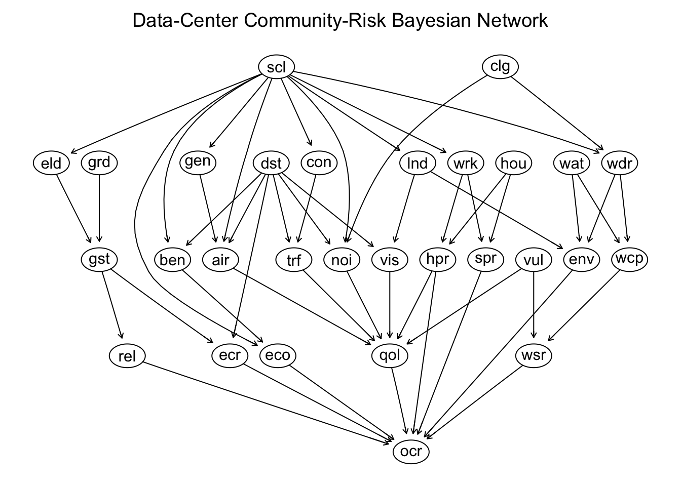
Some DAG Statistics
There are a few statistics that may provide some insight into the structure of a Bayesian Network.
Average Markov Blanket Size
In a Bayesian network, a Markov blanket of a target variable consists of the variable’s parent nodes, child nodes, and spouses child nodes, the other parents of the children. These are the nodes that determine the target variables behavior. In general a smaller value for average Markov blanket size indicates a sparse network and lower computational complexity (the computational power required for probabilistic inference)
Average Branching Factor
The branching factor of a node is equal to the number of direct children. The Average Branching Factor is the total number of directed edges divided by the total number of nodes. This may be interpreted as the average spread of downstream influence.
Average Neighborhood Size
The neighborhood of a node consists of both its direct parents and its direct children, treating the graph as undirected. Average neighborhood size is the average number of incoming and outgoing connections.
This block of codes computes these statistics, which may be useful in comparing variations of the network.
Network Statistics Calculations
#library(bnlearn)

# dag should be a bnlearn network created with model2network(),
# empty.graph(), hc(), tabu(), gs(), etc.

node_names <- nodes(dag)

# Markov blanket size for each node
markov_blanket_sizes <- sapply(
  node_names,
  function(node) {
    length(mb(dag, node))
  }
)

# Direct neighbours = parents + children
neighbourhood_sizes <- sapply(
  node_names,
  function(node) {
    direct_neighbours <- unique(c(
      parents(dag, node),
      children(dag, node)
    ))

    length(direct_neighbours)
  }
)

# Branching factor = number of children
branching_factors <- sapply(
  node_names,
  function(node) {
    length(children(dag, node))
  }
)

# Network-level averages
network_statistics <- data.frame(
  Statistic = c(
    "Average Markov blanket size",
    "Average neighbourhood size",
    "Average branching factor"
  ),
  Value = c(
    mean(markov_blanket_sizes),
    mean(neighbourhood_sizes),
    mean(branching_factors)
  )
)

network_statistics$Value <- round(
  network_statistics$Value,
  digits = 2
)

network_statistics
Statistic Value
1 Average Markov blanket size 7.31
2 Average neighbourhood size 3.52
3 Average branching factor 1.76The code to calculate Markov blanket size, neighborhood size and branching factor for each node is in this code block, but is commented out as a default.
Individual Node Statistics Calculations
node_statistics <- data.frame(
  Node = node_names,
  MB_Size = as.numeric(markov_blanket_sizes),
  Neigh_Size = as.numeric(neighbourhood_sizes),
  BF_Size = as.numeric(branching_factors),
  row.names = NULL
)

#node_statistics
Synthetic Data
This code implements a custom structural risk-propagation simulator to generate synthetic data based on a Directed Acyclic Graph (DAG), estimates for the discrete probability distributions foverning the root nodes and influencer nodes, estimates of initial risk scores. Instead of relying on traditional Conditional Probability Tables this architecture utilizes a continuous, score-based risk-mapping framework. The simulation engine evaluates the nodes observation-by-observation in a strict topological ordering (parents before children). For each node, it calculates a localized Target Risk Score bounded between 0 and 1 (where 0 represents lowest risk/exposure and 1 represents highest). It then converts this target risk into discrete state probabilities using an exponential distance formula. This allows the network to linearly model highly complex, multi-parent conditional relationships.
Structure of the Data Generator
The data generation algorithm divides the DAG nodes into two distinct behavioral categories based on how their state-to-risk mappings are handled:
| Node Type | Definition & Purpose | Code Implementation |
|---|---|---|
| Direct Nodes | Baseline operational variables that have specific impacts on risk. Their states do not follow a uniform scale. Protective variables (like EconomicBenefit or AccessToBenefits) map inversely, where high values equal low risk. | Explicitly Mapped inside create_risk_mappings() via custom, hand-tuned numeric vectors (e.g., Distance = c(Adjacent = 1.00, Neighborhood = 0.80, …)). |
| Derived Nodes | Downstream environmental, social, infrastructure, or ultimate risk outcomes. They track consecutive intensities or severities that naturally follow a uniform logical progression from safe to severe. | Dynamically Populated using a single, reusable standard_mapping array (Low = 0.15, Moderate = 0.50, High = 0.85) iterated over a list of standard_risk_nodes. |
Prior probabilities are only assigned to root states (states that have no parents). For non-root (child) nodes, the distributions of probabilities for states like “Low”, “Moderate”, and “High” are not static. These are generated dynamically for every single row using a 4-step pipeline that maps parental risk onto an exponential distance curve.
Step 1: Compress Parent States into a Single Risk Score
The code looks at the already-generated states of the child’s parents in the current row. It translates those text states into numeric risk values using create_risk_mappings() and calculates a weighted average:
\[ \text{Parent\_Risk} = \frac{\sum_{i=1}^{m} \text{Parent\_Score}_{i} \times \text{Parent\_Weight}_{i}}{\sum_{i=1}^{m} \text{Parent\_Weight}_{i}} \]
This compresses multiple complex parents into a single, scalar value between \((0.00\) and \(1.00\).
Step 2: Scale and Add Environmental Noise
Next, the function calculate_state_probabilities() adjusts this base parent risk to account for structural sensitivity, global scenario shifts, and inevitable real-world randomness: for example
\[\text{target\_risk} = \text{conditional\_risk} + \text{global\_risk\_shift} + N(\mu = 0, \sigma = 1)\]
For each child node risk assignment:
- Risk is moved up up or depending on the value
global_risk_shift. - Random Gaussian noise is injected
- The final value is forced to stay within the strict logical bounds:
\[\text{target\_risk}=max (0.01,\min (\text{target\_risk}_{\text{noisy}},0.99))\]
Step 3: Measure Exponential Distance (The Core Equation)
The probabilities for the child states are set as follows. The code calculates how far each possible child state’s predefined risk score (e.g., \(\text{Low} = 0.15\), \(\text{Moderate} = 0.50\), \(\text{High} = 0.85\)) is from the dynamic \(\text{Target\ Risk}\) calculated in Step 2. It runs these distances through a Laplacian radial kernel.:
\[P_{\text{raw}}(\text{state}) = e^{-c \cdot |\text{State Score} - \text{Target Risk}|}\]
Where:
- \(c = 6\) represents the concentration constant.
- This steepness filter ensures that states mathematically closest to the \(\text{Target\ Risk}\) get an exponentially larger value, while states far away drop rapidly toward zero.
Step 4: Normalize to Sum to 1.00
Because exponential distance calculations do not naturally yield valid probabilities, the raw scores are passed to normalize_probabilities(). The code sums up all the raw exponential values for that node and divides each individual score by that sum:
\[P_{\text{final}}(\text{state})=\frac{P_{\text{raw}}(\text{state})}{\sum _{j\in \text{States}}P_{\text{raw}}(j)}\]
This guarantees that the final array of weights for Low, Moderate, and High satisfies the fundamental probability axiom: \(\sum _{j\in \text{States}}P_{\text{final}}(j)=1.00\)
The resulting vector is ready for the sample() function to execute a weighted random draw for that row.
Data Generator Code
The following code implements the code to generate the data, and contains the default values for the probabilities of root node distributions of “Low”, “Moderate” and “High” risk and default values for risk estimates.
Show the code
# ================================================================
# Synthetic data generation from a bnlearn DAG
# ================================================================

#library(bnlearn)

# ----------------------------------------------------------------
# Main function
# ----------------------------------------------------------------
generate_synthetic_data <- function(
  n = 10000,
  global_risk_shift = 0.00,
  parent_effect_strength = 1.00,
  conditional_noise = 0.10
) {
  # ARCHITECTURAL NOTE: Dynamic environment lookup lets the function bypass bnlearn's
  # restrictive function signatures while maintaining access to the global network structure.
  if (!exists("dag", envir = parent.frame(), inherits = TRUE)) {
    stop("An object named 'dag' must exist before calling generate_synthetic_data().")
  }
  dag <- get("dag", envir = parent.frame(), inherits = TRUE)

  # Structural defensive validation steps
  validate_dag(dag)
  validate_generator_arguments(n, global_risk_shift, parent_effect_strength, conditional_noise)

  # Bundle configurations into a centralized configuration object
  config <- create_network_config(
    n = n,
    global_risk_shift = global_risk_shift,
    parent_effect_strength = parent_effect_strength,
    conditional_noise = conditional_noise
  )

  # Execute the core simulation pipeline
  generate_rows_from_dag(dag = dag, config = config)
}

# ----------------------------------------------------------------
# Configuration
# ----------------------------------------------------------------
create_network_config <- function(n, global_risk_shift, parent_effect_strength, conditional_noise, seed = 20260921) {
  list(
    n = n,
    seed = seed,
    global_risk_shift = global_risk_shift,
    parent_effect_strength = parent_effect_strength,
    conditional_noise = conditional_noise,
    states = create_node_states(),
    root_probabilities = create_root_probabilities(),

    # PARENT WEIGHTING MATRIX: Allows specific upstream nodes to exert a stronger
    # or weaker relative pull on their children during the weighted average calculation.
    parent_weights = c(
      Distance = 1.20, Scale = 1.00, Cooling = 1.00, GridCapacity = 1.00,
      HousingAvailability = 1.00, Vulnerability = 1.10, WaterAvailability = 1.00
    ),
    risk_mappings = create_risk_mappings()
  )
}

create_node_states <- function() {
  # Definition of ordinal categorical states for every node in the entire network universe
  list(
    Distance = c("Adjacent", "Neighborhood", "Municipality", "Watershed", "Regional", "Global"),
    Scale = c("Small", "Medium", "Large", "Hyperscale"),
    Cooling = c("AirCooled", "Hybrid", "Evaporative", "WaterIntensive"),
    GridCapacity = c("Adequate", "Constrained", "SeverelyConstrained"),
    HousingAvailability = c("Adequate", "Tight", "SeverelyConstrained"),
    Vulnerability = c("Low", "Moderate", "High"),
    WaterAvailability = c("Abundant", "SeasonalStress", "Scarce"),
    AccessToBenefits = c("Low", "Moderate", "High"),
    BackupGeneration = c("Low", "Moderate", "Extensive"),
    ConstructionIntensity = c("Low", "Moderate", "High"),
    ElectricityDemand = c("Low", "Moderate", "High", "Extreme"),
    LandFootprint = c("Low", "Moderate", "High"),
    NoiseExposure = c("Low", "Moderate", "High"),
    WaterDemand = c("Low", "Moderate", "High"),
    WorkforceDemand = c("Low", "Moderate", "High"),
    AirQualityExposure = c("Low", "Moderate", "High"),
    EconomicBenefit = c("Low", "Moderate", "High"),
    EnvironmentalDegradation = c("Low", "Moderate", "High"),
    GridStress = c("Low", "Moderate", "High"),
    HousingPressure = c("Low", "Moderate", "High"),
    ServicePressure = c("Low", "Moderate", "High"),
    TrafficExposure = c("Low", "Moderate", "High"),
    VisualLandUseExposure = c("Low", "Moderate", "High"),
    WaterCompetition = c("Low", "Moderate", "High"),
    ElectricityCostRisk = c("Low", "Moderate", "High"),
    QualityOfLifeRisk = c("Low", "Moderate", "High"),
    ReliabilityRisk = c("Low", "Moderate", "High"),
    WaterSecurityRisk = c("Low", "Moderate", "High"),
    OverallCommunityRisk = c("Low", "Moderate", "High")
  )
}

# create_root_probabilities sets the probability distributions for how frequently these sates occur.
create_root_probabilities <- function() {
  # Baseline categorical probability distributions applied strictly to exogenous Root Nodes (no parents)
  list(
    Distance = c(Adjacent = 0.10, Neighborhood = 0.18,
                 Municipality = 0.25, Watershed = 0.22, Regional = 0.18, Global = 0.07),
    Scale = c(Small = 0.15, Medium = 0.35, Large = 0.35, Hyperscale = 0.15),
    Cooling = c(AirCooled = 0.30, Hybrid = 0.30, Evaporative = 0.25, WaterIntensive = 0.15),
    GridCapacity = c(Adequate = 0.50, Constrained = 0.35, SeverelyConstrained = 0.15),
    HousingAvailability = c(Adequate = 0.45, Tight = 0.35, SeverelyConstrained = 0.20),
    Vulnerability = c(Low = 0.45, Moderate = 0.35, High = 0.20),
    WaterAvailability = c(Abundant = 0.45, SeasonalStress = 0.35, Scarce = 0.20)
  )
}

# risk mappings are not probabilities. They do not sum to 1.0. They quantify the downstream impact or "hazard level" of a state once it has been selected.
create_risk_mappings <- function() {
  # DIRECT NODES: Hand-calibrated risk translations mapping structural categories to numeric impacts.
  mappings <- list(
    Distance = c(Adjacent = 1.00, Neighborhood = 0.80, Municipality = 0.45, Watershed = 0.25, Regional = 0.10, Global = 0.02),
    Scale = c(Small = 0.25, Medium = 0.50, Large = 0.75, Hyperscale = 1.00),
    Cooling = c(AirCooled = 0.25, Hybrid = 0.55, Evaporative = 0.75, WaterIntensive = 0.95),
    GridCapacity = c(Adequate = 0.10, Constrained = 0.55, SeverelyConstrained = 0.95),
    HousingAvailability = c(Adequate = 0.10, Tight = 0.60, SeverelyConstrained = 0.95),
    Vulnerability = c(Low = 0.10, Moderate = 0.55, High = 0.95),
    WaterAvailability = c(Abundant = 0.10, SeasonalStress = 0.60, Scarce = 0.95),
    LandFootprint = c(Low = 0.25, Moderate = 0.60, High = 1.00),
    ElectricityDemand = c(Low = 0.15, Moderate = 0.40, High = 0.70, Extreme = 1.00),
    WaterDemand = c(Low = 0.15, Moderate = 0.55, High = 1.00),
    ConstructionIntensity = c(Low = 0.25, Moderate = 0.60, High = 1.00),
    BackupGeneration = c(Low = 0.25, Moderate = 0.60, Extensive = 1.00),
    WorkforceDemand = c(Low = 0.15, Moderate = 0.55, High = 1.00),

    # PROTECTIVE VARIABLE CONVERSION: Inverts risk mapping so high benefits lower the downstream risk score
    AccessToBenefits = c(Low = 0.85, Moderate = 0.50, High = 0.15),
    EconomicBenefit = c(Low = 0.85, Moderate = 0.50, High = 0.15)
  )

  # DERIVED NODES: Programmatic batch generation of standardized downstream risk states
  standard_risk_nodes <- c(
    "NoiseExposure", "AirQualityExposure", "TrafficExposure", "VisualLandUseExposure",
    "EnvironmentalDegradation", "GridStress", "HousingPressure", "ServicePressure",
    "WaterCompetition", "ElectricityCostRisk", "QualityOfLifeRisk", "ReliabilityRisk",
    "WaterSecurityRisk", "OverallCommunityRisk"
  )
  standard_mapping <- c(Low = 0.15, Moderate = 0.50, High = 0.85)
  for (node in standard_risk_nodes) {
    mappings[[node]] <- standard_mapping
  }
  mappings
}

# ----------------------------------------------------------------
# Generate all observations
# ----------------------------------------------------------------
generate_rows_from_dag <- function(dag, config) {
  if (!is.null(config$seed)) { set.seed(config$seed) }

  dag_nodes <- bnlearn::nodes(dag)

  # CRITICAL ARCHITECTURAL STEP: Nodes must be sorted topologically.
  # This guarantees a parent node has simulated data before a child tries to read it.
  generation_order <- get_topological_order(dag)

  validate_configuration(dag = dag, dag_nodes = dag_nodes, config = config)

  # OPTIMIZATION: Memory pre-allocation prevents R from copying data frames repeatedly in memory loops.
  result <- setNames(vector("list", length(dag_nodes)), dag_nodes)
  for (node in dag_nodes) {
    result[[node]] <- character(config$n)
  }

  # Row-by-row simulation loop
  for (i in seq_len(config$n)) {
    one_row <- generate_one_observation(dag = dag, generation_order = generation_order, config = config)
    for (node in dag_nodes) {
      result[[node]][i] <- one_row[[node]]
    }
  }

  # Formatting raw arrays back into structured, clean R Factor columns
  result <- as.data.frame(result, stringsAsFactors = FALSE, check.names = FALSE)
  for (node in dag_nodes) {
    result[[node]] <- factor(result[[node]], levels = config$states[[node]])
  }
  result
}

generate_one_observation <- function(dag, generation_order, config) {
  row <- setNames(vector("list", length(generation_order)), generation_order)

  # Sequentially process each node down the causal chain
  for (node in generation_order) {
    node_states <- config$states[[node]]
    node_parents <- bnlearn::parents(dag, node)

    # ROOT NODE INTERCEPT: If a node has no parents, sample from its static baseline distribution.
    if (length(node_parents) == 0) {
      probabilities <- config$root_probabilities[[node]]
      probabilities <- probabilities[node_states]
      probabilities <- normalize_probabilities(probabilities)
      names(probabilities) <- node_states
      row[[node]] <- sample_state(probabilities)
      next
    }

    # CHILD NODE COMPUTATION: Compress multi-parent states into a singular continuous score
    parent_risk <- calculate_parent_risk(parents = node_parents, row = row, config = config)

    # LINEAR SENSITIVITY TRANSFORM: Shifts values relative to a 0.5 mid-point based on network effects strength
    conditional_risk <- 0.5 + config$parent_effect_strength * (parent_risk - 0.5)

    # Map the scalar risk target back into a probability distribution across discrete states
    probabilities <- calculate_state_probabilities(
      node = node, states = node_states,
      conditional_risk = conditional_risk, config = config
    )
    row[[node]] <- sample_state(probabilities)
  }
  row
}

# ----------------------------------------------------------------
# Parent-risk calculations

## ----------------------------------------------------------------
calculate_parent_risk <- function(parents, row, config) {
## Extract configured or default (1.00) relative weights for each parent
parent_weights <- vapply(parents, function(parent) {
get_parent_weight(parent = parent, config = config)
}, numeric(1))
## Convert each parent's current simulated text state into its corresponding numeric risk score
weighted_scores <- vapply(seq_along(parents), function(i) {
parent <- parents[[i]]
parent_score <- state_risk_score(node = parent, state = row[[parent]], config = config)
parent_score * parent_weights[[i]]
}, numeric(1))
## COMPRESSION METRIC: Calculated as a weighted average to safely scale multi-parent risks between 0 and 1
sum(weighted_scores) / sum(parent_weights)
}
get_parent_weight <- function(parent, config) {
weights <- config$parent_weights
## Defensive safety check guarding against structural mismatches between the input DAG and configuration vectors
if (is.null(weights) || is.null(names(weights)) || !parent %in% names(weights)) {
return(1.00)
}
weight <- unname(weights[[parent]])
if (!is.finite(weight) || weight < 0) {
stop("The weight for parent '", parent, "' must be a finite, non-negative number.")
}
weight
}
## ----------------------------------------------------------------## Conditional probability calculations## ----------------------------------------------------------------
calculate_state_probabilities <- function(node, states, conditional_risk, config) {
## STOCHASTIC PERTURBATION: Incorporates systemic shifts (scenarios) and random environmental noise via Gaussian distributions.
target_risk <- conditional_risk + config$global_risk_shift + rnorm(n = 1, mean = 0, sd = config$conditional_noise)
## Hard boundaries preventing mathematically invalid probabilities outside (0, 1)
target_risk <- max(0.01, min(target_risk, 0.99))
state_scores <- vapply(states, function(state) {
state_risk_score(node = node, state = state, config = config)
}, numeric(1) )
## EXPONENTIAL DISTANCE KERNEL (RBF-style): States whose static risk mappings sit closest## to the dynamic target_risk calculation receive exponentially higher generation probabilities.
concentration <- 6
probabilities <- exp(-concentration * abs(state_scores - target_risk))
## Convert distances to a standard, valid probability array summing to 1.00
probabilities <- normalize_probabilities(probabilities)
names(probabilities) <- states
probabilities
}
state_risk_score <- function(node, state, config) {
mapping <- config$risk_mappings[[node]]
if (is.null(mapping)) { stop("No risk mapping is defined for node '", node, "'.") }
if (!state %in% names(mapping)) { stop("No risk score is defined for node '", node, "' and state '", state, "'.") }
unname(mapping[[state]])
}
normalize_probabilities <- function(probabilities) {
probabilities <- pmax(probabilities, 0)
if (length(probabilities) == 0) { stop("Cannot normalize an empty probability vector.") }
## Uniform fallback handling to preserve math stability if all states evaluate to a zero score
if (sum(probabilities) == 0) {
probabilities <- rep(1 / length(probabilities), length(probabilities))
} else {
probabilities <- probabilities / sum(probabilities)
}
probabilities
}
sample_state <- function(probabilities) {
## Executes a standard weighted random draw based on the dynamically formulated distribution
sample(x = names(probabilities), size = 1, prob = probabilities)
}
## ----------------------------------------------------------------## Validation & Topological ordering## ----------------------------------------------------------------
validate_dag <- function(dag) {
if (!inherits(dag, "bn")) { stop("dag must be a bnlearn network object with class 'bn'.") }
}
validate_generator_arguments <- function(n, global_risk_shift, parent_effect_strength, conditional_noise) {
if (length(n) != 1 || !is.numeric(n) || is.na(n) || n < 1 || n != as.integer(n)) { stop("n must be one positive integer.") }
numeric_values <- c(global_risk_shift, parent_effect_strength, conditional_noise)
if (any(!is.numeric(numeric_values)) || any(!is.finite(numeric_values))) { stop("global_risk_shift, parent_effect_strength, and conditional_noise must be finite numeric values.") }
if (conditional_noise < 0) { stop("conditional_noise must be non-negative.") }
}
validate_configuration <- function(dag, dag_nodes, config) {
missing_states <- setdiff(dag_nodes, names(config$states))
if (length(missing_states) > 0) { stop("No state definitions supplied for: ", paste(missing_states, collapse = ", ")) }
root_nodes <- dag_nodes[vapply(dag_nodes, function(node) { length(bnlearn::parents(dag, node)) == 0 }, logical(1))]
missing_root_probabilities <- setdiff(root_nodes, names(config$root_probabilities))
if (length(missing_root_probabilities) > 0) { stop("No root probabilities supplied for: ", paste(missing_root_probabilities, collapse = ", ")) }
missing_mappings <- setdiff(dag_nodes, names(config$risk_mappings))
if (length(missing_mappings) > 0) { stop("No risk mappings supplied for: ", paste(missing_mappings, collapse = ", ")) }
}
get_topological_order <- function(dag) {
## KAHN'S ALGORITHM EXTENSION: Resolves dependence hierarchies.## Iteratively extracts nodes whose parents have already crossed the resolution boundary.
dag_nodes <- bnlearn::nodes(dag)
remaining_nodes <- dag_nodes
ordering <- character(0)
while (length(remaining_nodes) > 0) {
available_nodes <- remaining_nodes[vapply(remaining_nodes, function(node) {
node_parents <- bnlearn::parents(dag, node)
all(node_parents %in% ordering)
}, logical(1))]
# If no nodes are free but un-generated items remain, a cyclic loop exists.
if (length(available_nodes) == 0) {
stop("The graph does not appear to be acyclic, or its parent relationships could not be resolved.")
}
available_nodes <- sort(available_nodes)
ordering <- c(ordering, available_nodes)
remaining_nodes <- setdiff(remaining_nodes, available_nodes)
}
ordering
}
This code runs the function to generate the synthetic data. It is the place where changes can be made to increase the risk intensity of the probability distributions.
Show the code
# ================================================================
# Usage
# ================================================================
#
# A DAG named `dag` must exist first.

# Global scenario controls.
  # global_risk_shift
  # 0.00 = baseline moderate-risk scenario
  # Positive values increase risk throughout the network
  # Negative values decrease risk throughout the network

  #  parent_effect_strength
  # Controls how strongly parent risk affects child risk.
  # 1.00 is the default.

  # conditional_noise
  # Controls random variation in conditional probabilities.
  # Larger values produce less deterministic relationships.

#
synthetic <- generate_synthetic_data(
  n = 5000,
  global_risk_shift = 0.00,
  parent_effect_strength = 1.0,
  conditional_noise = 0.10
)
#
# str(synthetic)
# head(synthetic)
# ================================================================
Check the Data
You can also easily write queries to check that the proportions of data comprising the states for each node of the simulated match the input distributions that were used to create the data. For example the following code shows a query to check distance.
Show the code
state_proportions <- function(data) {
  lapply(data, function(x) {
    round(prop.table(table(x)), 3)
  })
}

proportions <- state_proportions(synthetic)
proportions$Distance
x
Adjacent Neighborhood Municipality Watershed Regional Global
0.100 0.166 0.253 0.231 0.179 0.071 Show the code
data_summary_table <- do.call(
  rbind,
  lapply(names(synthetic), function(node) {
    counts <- table(synthetic[[node]])
    proportions <- prop.table(counts)

    data.frame(
      Node = node,
      State = names(counts),
      Count = as.integer(counts),
      Proportion = round(as.numeric(proportions), 3),
      row.names = NULL
    )
  })
)

#head(data_summary_table,10)
These proportions match numbers which were inputs to the code above which generates the data frame synthetic.
Distance = c( Adjacent = 0.10, Neighborhood = 0.18, Municipality = 0.25, Watershed = 0.22, Regional = 0.18, Global = 0.07 ),
The above code also produces the table data_summary_table which formats the generated proportions for all of the nodes. The following table summarizes the probability distributions across the states of the risk specific nodes.
Show the code
risk_nodes <- c(
  "GridStress",
  "HousingPressure",
  "ServicePressure",
  "TrafficExposure",
  "VisualLandUseExposure",
  "WaterCompetition",
  "ElectricityCostRisk",
  "QualityOfLifeRisk",
  "ReliabilityRisk",
  "WaterSecurityRisk",
  "OverallCommunityRisk"
)

risk_summary <- do.call(
  rbind,
  lapply(risk_nodes, function(node) {
    p <- prop.table(table(synthetic[[node]]))

    data.frame(
      Node = node,
      Low = unname(p["Low"]),
      Moderate = unname(p["Moderate"]),
      High = unname(p["High"])
    )
  })
)

risk_summary
Node Low Moderate High
1 GridStress 0.2788 0.4614 0.2598
2 HousingPressure 0.2562 0.4352 0.3086
3 ServicePressure 0.2438 0.4474 0.3088
4 TrafficExposure 0.2432 0.4764 0.2804
5 VisualLandUseExposure 0.2632 0.4674 0.2694
6 WaterCompetition 0.2602 0.4496 0.2902
7 ElectricityCostRisk 0.3258 0.4554 0.2188
8 QualityOfLifeRisk 0.2260 0.5550 0.2190
9 ReliabilityRisk 0.3070 0.4132 0.2798
10 WaterSecurityRisk 0.3138 0.4476 0.2386
11 OverallCommunityRisk 0.2068 0.5744 0.2188And, here is the probability distribution for the states of Overall Community Risk conditioned by scale of the data center.
Show the code
round(
  with(
    synthetic,
    prop.table(table(Scale, OverallCommunityRisk), margin = 1)
  ),
  3
)
OverallCommunityRisk
Scale Low Moderate High
Small 0.350 0.549 0.100
Medium 0.229 0.598 0.173
Large 0.165 0.579 0.256
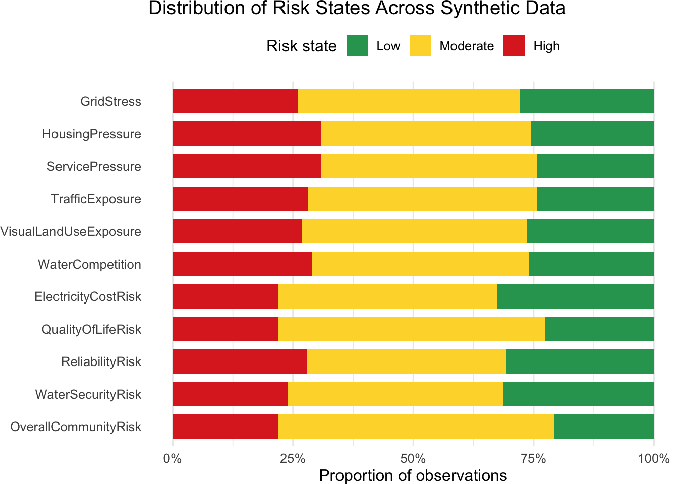
Hyperscale 0.113 0.535 0.352Notice that the probabilities associated with the “Moderate” state of the multinomial distribution for Overall Community Risk to be higher than the probabilities for the “High” state at all level of Scale. These proportions are reflected in the chart below.
Visualizing the synthetic data
The following plot shows the relative proportions of “Low”, “Medium” and “High” risk states in the synthetic data for the risk nodes of the DAG. Notice that Overall Community Risk is broadly consistent with the other risk nodes that feed into it.
Show the code
# library(dplyr)
# library(tidyr)
# library(ggplot2)

risk_nodes <- c(
  "GridStress",
  "HousingPressure",
  "ServicePressure",
  "TrafficExposure",
  "VisualLandUseExposure",
  "WaterCompetition",
  "ElectricityCostRisk",
  "QualityOfLifeRisk",
  "ReliabilityRisk",
  "WaterSecurityRisk",
  "OverallCommunityRisk"
)

risk_long <- synthetic %>%
  select(all_of(risk_nodes)) %>%
  pivot_longer(
    cols = everything(),
    names_to = "Node",
    values_to = "Risk"
  ) %>%
  count(Node, Risk) %>%
  group_by(Node) %>%
  mutate(Proportion = n / sum(n)) %>%
  ungroup()

risk_long$Risk <- factor(
  risk_long$Risk,
  levels = c("Low", "Moderate", "High")
)

risk_long$Node <- factor(
  risk_long$Node,
  levels = rev(risk_nodes)
)

ggplot(risk_long, aes(x = Proportion, y = Node, fill = Risk)) +
  geom_col(width = 0.75) +
  scale_x_continuous(
    labels = scales::percent_format(),
    limits = c(0, 1)
  ) +
  scale_fill_manual(
    values = c(
      Low = "#2CA25F",
      Moderate = "#FDD835",
      High = "#DE2D26"
    )
  ) +
  labs(
    title = "Distribution of Risk States Across Synthetic Data",
    x = "Proportion of observations",
    y = NULL,
    fill = "Risk state"
  ) +
  theme_minimal(base_size = 12) +
  theme(
    legend.position = "top",
    panel.grid.major.y = element_blank()
  )
This plot shows the nodes produce the most “High” risk proportions.
Show the code
high_risk <- synthetic %>%
  select(all_of(risk_nodes)) %>%
  summarise(
    across(
      everything(),
      ~ mean(.x == "High")
    )
  ) %>%
  pivot_longer(
    cols = everything(),
    names_to = "Node",
    values_to = "HighRiskProportion"
  ) %>%
  arrange(HighRiskProportion)

ggplot(
  high_risk,
  aes(
    x = HighRiskProportion,
    y = reorder(Node, HighRiskProportion)
  )
) +
  geom_col(fill = "#DE2D26") +
  scale_x_continuous(
    labels = scales::percent_format(),
    limits = c(0, 1)
  ) +
  labs(
    title = "Prevalence of High-Risk States",
    x = "Observations classified as High",
    y = NULL
  ) +
  theme_minimal(base_size = 12)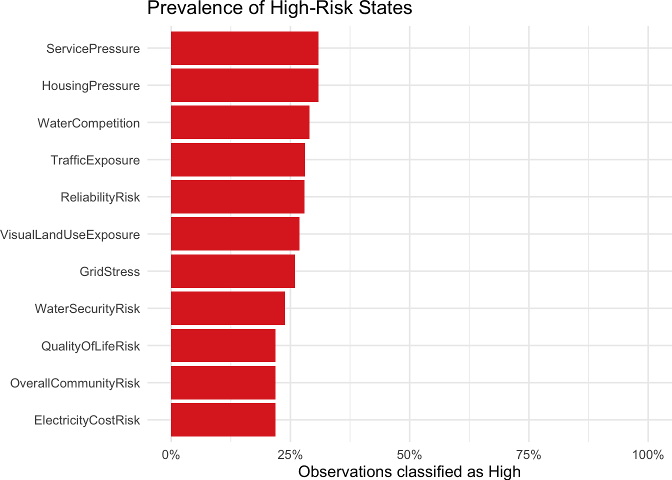
Fit the DAG
So far, we have only been working with the raw synthetic data, evaluating the estimates of risk which were put into the model. We have not yet fit the Bayesian Network to the data. Fitting the data enables:
- Making Bayesian Network inferences
- Making predictions
- Estimating the conditional probability tables from the synthetic data
Note that the method “bayes” used in the fit function means that the network is fit using “the classic Bayesian posterior estimator with a uniform prior matching that in the Bayesian Dirichlet equivalent (”bde”) score.
Show the code
# ------------------------------------------------------------
# 5. Fit the Bayesian Network
# ------------------------------------------------------------

fitted_bn <- bn.fit(
  dag,
  data = synthetic,
  method = "bayes",
  iss = 10
)
Query the Model
This next code shows how to directly query the model. For example: What is the probability that overall community risk is “High” when Scale is hyperscale?
Show the code
## Inspect Overall Community Risk, or any other node directly from the object
query <- cpquery(
  fitted_bn,
  event = (OverallCommunityRisk == "High"),
  evidence = (Scale == "Hyperscale")
)

query
[1] 0.3472178Or, what is the probability that Quality of Life Risk when Distance = Adjacent?
Show the code
cpquery(
  fitted_bn,
  event = (QualityOfLifeRisk == "High"),
  evidence = (Distance == "Adjacent")
)
[1] 0.4408929Make Predictions
Next we use the bnlearn predict function to bootstrap predictions of risk for each of the three risk states, “Low”, “Medium”, and “High”, over which probability distributions are computed for each node. The function call uses the default method method of prediction, “parents”, which computes the predicted values by “plugging in the new values for the parents of node in the local probability distribution of node extracted from fitted.”
Show the code
predicted <- predict(
  fitted_bn,
  node = "OverallCommunityRisk",
  data = synthetic,
  prob = TRUE,
  method = "parents"
)

# 1. Extract and transpose the probability matrix
probs <- t(attr(predicted, "prob"))
# 2. Assign column names for clarity
colnames(probs) <- c("Low", "Moderate", "High")
# 3. Generate summary statistics (Min, 1st Qu., Median, Mean, 3rd Qu., Max)
#summary(probs)
rounded_summary <- sapply(as.data.frame(probs), summary)
rounded_summary <- round(rounded_summary, digits = 4)
rounded_summary
Low Moderate High
Min. 0.0000 0.0001 0.0001
1st Qu. 0.0003 0.3333 0.0003
Median 0.0005 0.5000 0.0005
Mean 0.2069 0.5742 0.2189
3rd Qu. 0.3333 0.9990 0.3750
Max. 0.9998 0.9998 0.9998A first try to visualize the data might be to draw boxplots.
Show the code
# 1. Extract the probability matrix and convert to a data frame
prob_matrix <- t(attr(predicted, "prob"))
colnames(prob_matrix) <- c("Low", "Moderate", "High")
df_wide <- as.data.frame(prob_matrix)

# 2. Reshape data from WIDE to LONG format for ggplot2
df_long <- df_wide %>%
  pivot_longer(
    cols = everything(),
    names_to = "Risk_Category",
    values_to = "Probability"
  ) %>%
  # Ensure the categories stay in a logical order (Low -> Moderate -> High)
  mutate(Risk_Category = factor(Risk_Category, levels = c("Low", "Moderate", "High")))


# 3. Create the ggplot Boxplot
ggplot(df_long, aes(x = Risk_Category, y = Probability, fill = Risk_Category)) +
  # Draw the boxplots with custom outlier styling
  geom_boxplot(
    alpha = 0.7,
    outlier.color = "grey60",
    outlier.size = 1.5,
    outlier.shape = 16
  ) +
  # Overlay a diamond indicating the MEAN probability for each category
  stat_summary(fun = mean, geom = "point", shape = 18, size = 4, color = "black") +
  # Clean, minimal visual theme
  #theme_minimal(base_size = 13) +
  # Custom color palette (Green = Low, Yellow/Orange = Moderate, Red = High)
  scale_fill_manual(values = c("Low" = "#2ecc71", "Moderate" = "#f39c12", "High" = "#e74c3c")) +
  # Descriptive labels
  labs(
    title = "Comparison of Risk Category Probabilities",
    subtitle = "Boxplots showing medians and quartiles; black diamonds represent the mean",
    x = "Risk Category",
    y = "Predicted Probability (0 to 1)"
  ) +
  # Remove the legend since the x-axis already labels the categories
  theme(legend.position = "none")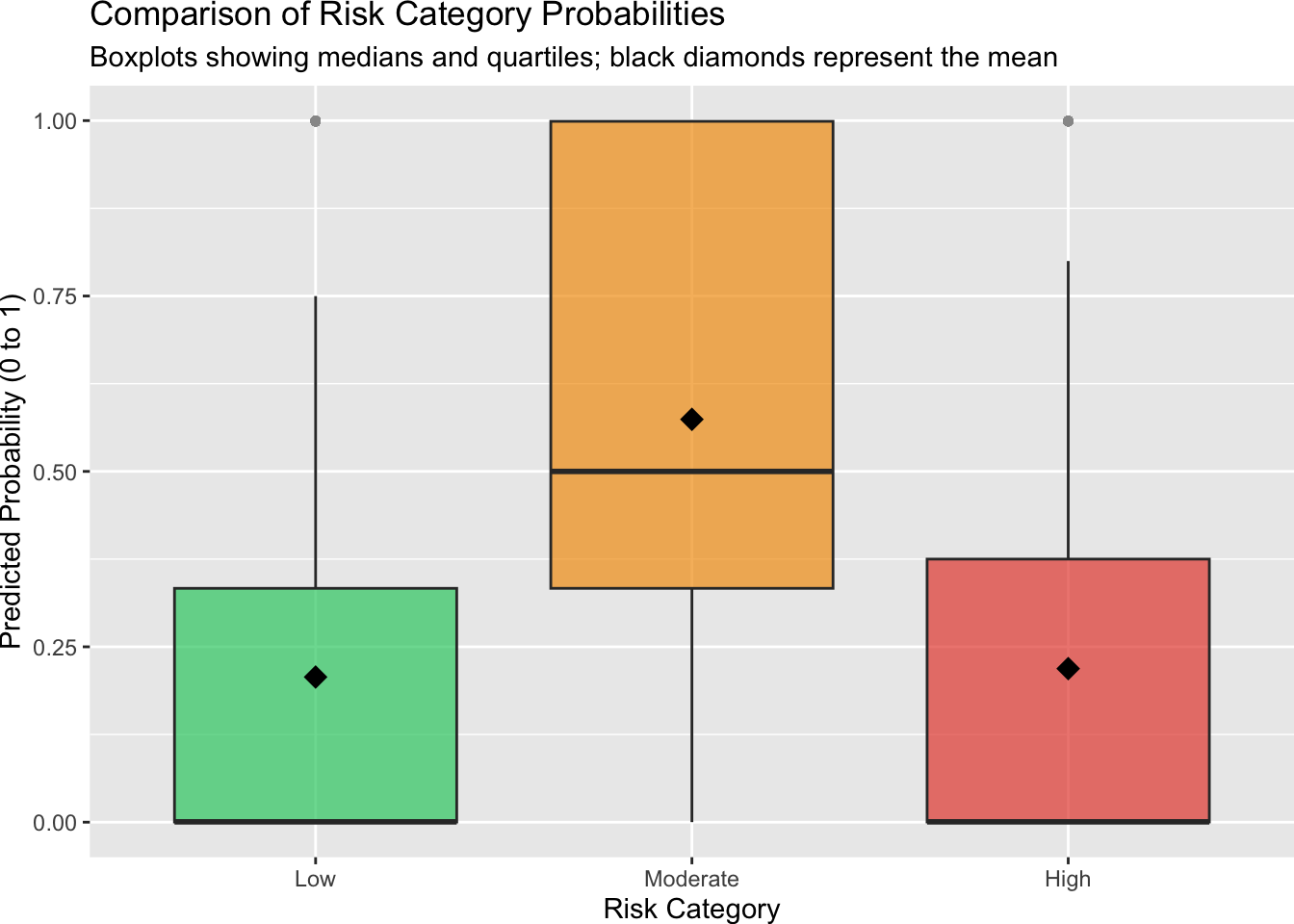
However, while boxplots can convey some idea about what is going on with the prediction data, it is important to remember that the predictions are not independently distributed they are constrained: \(P(\text{Low}) + P(\text{Moderate}) + P\text{(High}) = 1\). Boxplots cannot convey the shifting trade-offs between the three dependent probability states across individual bootstrap runs.
A better choice would be computing a tertiary plot which can be interpreted as follows.
- The apexes indicate “Low” “Moderate” and “High” risk so dots and heat contours that gather tightly in the top corner would be predicting a universally high risk profile the bootstraps.
- If the dots or contour heat map center lands square in the middle of the triangle then the network is predicting a uniform distribution (≈ 33.3% split across Low, Moderate, and High).
- If there is a smear stretching along the bottom axis between Low and Moderate, it indicates that while uncertainty fluctuates, the network has confidently ruled out High risk outcomes.
Show the code
library(ggtern)

# ----------------------------------------------------------------
# 1. Ingest Your bnlearn Bootstrap Matrix
# ----------------------------------------------------------------
prob_matrix <- t(attr(predicted, "prob"))
colnames(prob_matrix) <- c("Low", "Moderate", "High")
df_wide <- as.data.frame(prob_matrix)

# ----------------------------------------------------------------
# 2. Modernized Ternary Contoured Density Heatmap (No Warnings)
# ----------------------------------------------------------------
plot_density <- ggtern(data = df_wide, aes(x = Low, y = High, z = Moderate)) +
  # Computes and fills a 2D density surface inside the triangular space
  stat_density_tern(
    geom  = "polygon",
    # FIXED: Replaced deprecated ..level.. with the modern after_stat(level)
    aes(fill = after_stat(level), alpha = after_stat(level)),
    n     = 200,
    bdl   = 0.01,
    # FIXED: Mutes the out-of-bounds scale range warning safely
    na.rm = TRUE
  ) +
  scale_fill_gradient(low = "#ffeda0", high = "#f03b20") +
  scale_alpha_continuous(range = c(0.2, 0.85)) +
  geom_point(alpha = 0.2, size = 0.8, color = "black") +
  theme_rgbw() +
  labs(
    title    = "Density Contour of Predicted Community Risk Profile",
    subtitle = "Heatmap showing where bootstrap predictions cluster",
    x        = "Low Risk",
    y        = "High Risk",
    z        = "Moderate Risk",
    # FIX 1: Customizing the arrow labels around the triangle (Counterclockwise)
    xarrow   = "Decreasing Risk",
    yarrow   = "Increasing Risk",
    zarrow   = "Increasing Risk"
  ) +
  theme(
    plot.title      = element_text(face = "bold", size = 14),
    legend.position = "none",
    tern.axis.arrow.show = TRUE
    #plot.margin = margin(t = 10, r = 5, b = 10, l = 5, unit = "pt")
  )

print(plot_density)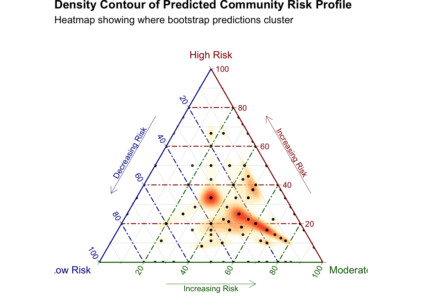
Stack Ridgeline Probabilities (Joyplots)
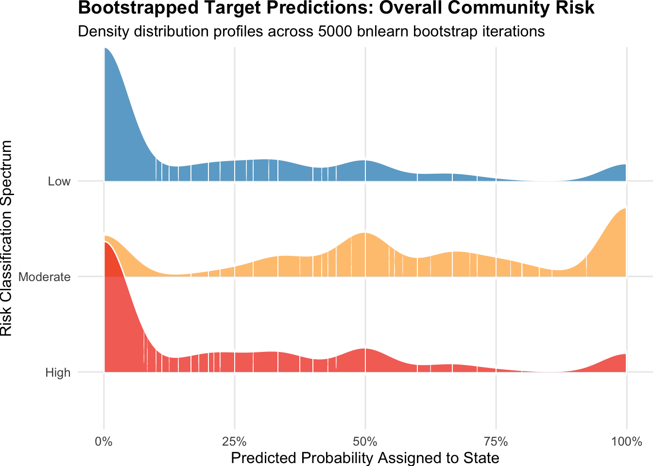
A second appropriate visualization is to produce a ridgeline plot grouped by Scale which is the primary scenario driver. These plots stack smooth, partially transparent density “waves” on top of one another along a unified 0–100% horizontal scale to facilitate comparisons. The densities for “Low”, “Moderate”, and “High” predicted risk states are stacked vertically. The plot reveals subtle variations in skewness across the bootstrap trials.
Show the code
# library(ggplot2)
# library(ggridges)
# library(tidyr)

# ----------------------------------------------------------------
# 1. Process Your Exact bnlearn Bootstrap Matrix
# ----------------------------------------------------------------
# Extract the probability matrix and convert to a data frame as specified
prob_matrix <- t(attr(predicted, "prob"))
colnames(prob_matrix) <- c("Low", "Moderate", "High")
df_wide <- as.data.frame(prob_matrix)

# Add a distinct identifier for each bootstrap replication row
df_wide$Bootstrap_ID <- seq_len(nrow(df_wide))

# ----------------------------------------------------------------
# 2. Reshape Data for Ridge Profiling
# ----------------------------------------------------------------
# Pivot data into a long format optimized for ggplot2 tracking
df_long <- pivot_longer(
  df_wide,
  cols      = c("Low", "Moderate", "High"),
  names_to  = "Risk_State",
  values_to = "Predicted_Probability"
)

# Enforce vertical layout hierarchy (High on top, Low on bottom)
df_long$Risk_State <- factor(df_long$Risk_State, levels = c("High", "Moderate", "Low"))

# ----------------------------------------------------------------
# 3. Render Ridgeline Distribution Profiles
# ----------------------------------------------------------------
ggplot(df_long, aes(x = Predicted_Probability, y = Risk_State, fill = Risk_State)) +
  # Adds smooth density waves with the actual bootstrap data points marked underneath as tick marks
  geom_density_ridges(
    alpha = 0.75, scale = 1.4, color = "white",
    jittered_points = TRUE, point_shape = "|", point_size = 2, point_alpha = 0.3
  ) +
  # Consistent color schema matching the network architecture
  scale_fill_manual(values = c("Low" = "#2b8cbe", "Moderate" = "#feb24c", "High" = "#f03b20")) +
  scale_x_continuous(labels = scales::percent_format(), limits = c(0, 1)) +
  labs(
    title    = "Bootstrapped Target Predictions: Overall Community Risk",
    subtitle = paste("Density distribution profiles across", nrow(df_wide), "bnlearn bootstrap iterations"),
    x        = "Predicted Probability Assigned to State",
    y        = "Risk Classification Spectrum"
  ) +
  theme_minimal(base_size = 12) +
  theme(
    legend.position  = "none",
    plot.title       = element_text(face = "bold"),
    panel.grid.minor = element_blank()
  )
Contingency Tables
The details of the fitted distribution for all of the nodes are revealed by examining the contingency tables the individual nodes. These show the probability distributions of risk state for child nodes contingent on their parent nodes, To begin this examination, let’s first look at the tables for Housing Pressure which has only two parents: Workforce Demand and Housing availability. Notice that the columns of each table sum to 1. The first table considers the scenario where Workforce Demand is “Low”. Each column gives a value of the probability of Housing Availability for the “Low”, “Moderate” and “High” Housing Pressure risk states.
The (3,3) entry in each tables shows the probability of Severely Constrained Housing Pressure for a high risk scenario as Work Force Demand moves from “Low” to “Moderate”, and then “High”.
Show the code
# Extract the conditional-probability table

fitted_bn$HousingPressure$prob
, , WorkforceDemand = Low
HousingAvailability
HousingPressure Adequate Tight SeverelyConstrained
Low 0.82534532 0.34708510 0.11661093
Moderate 0.15809619 0.58509638 0.67045708
High 0.01655850 0.06781852 0.21293200
, , WorkforceDemand = Moderate
HousingAvailability
HousingPressure Adequate Tight SeverelyConstrained
Low 0.49983482 0.09918699 0.05124471
Moderate 0.44720846 0.61065041 0.32834061
High 0.05295672 0.29016260 0.62041467
, , WorkforceDemand = High
HousingAvailability
HousingPressure Adequate Tight SeverelyConstrained
Low 0.13366947 0.02910443 0.01941528
Moderate 0.64492997 0.22603268 0.10475223
High 0.22140056 0.74486289 0.87583249The problem with examining contingency tables is that the output generated by a Bayesian Network model for nodes with many parents is voluminous. For each node in the network, a table of contingent probabilities is generated for each set of factors of the parent nodes. For example, Housing Pressure has three levels (low, moderate and high) and two parents: Housing Availability and Workforce Demand. Housing Availability has three levels, adequate, severely constrained, and tight, while Workforce Demand has three levels: lower moderate and high. These lead to the manageable three tables above.
Overall Community Risk, on the other hand, has two 2,187 tables. (See the Appendix for the calculation). One way to deal with this situation is to flatten out the contingency tables into a data frame that contains a column for each parent variable. The following code flattens out the tables for Overall Community Risk, selects the rows “High” rows from the distribution, and sorts them by decreasing probability to produce a table with 6,561 rows. Each row can be considered to be a path through the space of all possible combinations of parent variables that contribute to Overall Community Risk. Each row Here are the top 5 paths.
Show the code
# Extract the conditional-probability table
prob_table <- fitted_bn$OverallCommunityRisk$prob

# Convert the multidimensional table to a data frame
high_risk_probabilities <- as.data.frame(prob_table)

#dfh <- high_risk_probabilities
# the entire flat table for Overall Community Risk has 19,683 rows
# Rename the probability column
names(high_risk_probabilities)[ncol(high_risk_probabilities)] <- "Probability"

# Keep only cases where OverallCommunityRisk is High
high_risk_probabilities <- subset(
  high_risk_probabilities,
  OverallCommunityRisk == "High"
)

# high_risk_probabilities
# sort the combinations from the highest to the lowest high-risk probability:

high_risk_probabilities <- high_risk_probabilities[
  order(high_risk_probabilities$Probability,decreasing = TRUE),]

# change names to print table
#original_names <- names(high_risk_probabilities)

#Table with short column names and no row names for printing

HRP <- high_risk_probabilities
names(HRP) <- c("ocr", "eco", "ecr", "env", "hpr", "qol", "rel", "spr", "wsr", "Prob")
rownames(HRP) <- NULL
HRP$Prob <- round(HRP$Prob, digits = 4)
head(HRP, 5)
ocr eco ecr env hpr qol rel spr wsr Prob
1 High Moderate Moderate High High High High High High 0.9998
2 High Low High High High Moderate Moderate High Low 0.9997
3 High Low Moderate High High High Moderate High Low 0.9997
4 High Low Moderate High High High High High Low 0.9997
5 High Low Moderate High Low Moderate Moderate Low High 0.9997Show the code
# Change names back
#names(high_risk_probabilities) <- original_names

#some useful redundant code
# risk_flat <- flatten_bnlearn_cpt(
#   fitted_bn = fitted_bn,
#   child_name = "OverallCommunityRisk"
# )
#
# head(risk_flat)
#
#
# # Descending
# sorted_risk_flat <- risk_flat %>%
#   arrange(desc("Probability"))
#
# head(sorted_risk_flat)
Notice that the combinations comprising the first five paths all lead to similar risk score. In fact, the first 332 rows of the table produce a risk score above 0.99. This situation unfortunately eliminates the naive hope of easily identifying a few paths that could materially change Overall Community Risk. Here are the values for row 333.
Show the code
HRP[333,] ocr eco ecr env hpr qol rel spr wsr Prob
333 High Low High Moderate Moderate Moderate Moderate Moderate Moderate 0.7999Radar Plot
Another way to gain some intuition about how these paths vary is through radar plots. The following plot picks out three random rows from the Overall Community Risk flat table ans plots them on a circular path leading to Overall Community Risk.
Show the radar plot code
### First or random
plot_radar <- function(data, n_highlight = 5, selection_method = c("first", "random"), level_order = c("Low", "Moderate", "High"), tleg = 45) {
  selection_method <- match.arg(selection_method)

  categorical_vars <- c(
    "OverallCommunityRisk", "EconomicBenefit", "ElectricityCostRisk",
    "EnvironmentalDegradation", "HousingPressure", "QualityOfLifeRisk",
    "ReliabilityRisk", "ServicePressure", "WaterSecurityRisk"
  )

  required_vars <- c(categorical_vars, "Probability")
  missing_vars <- setdiff(required_vars, names(data))
  if (length(missing_vars) > 0) {
    stop(
      "Missing columns: ", paste(missing_vars, collapse = ", ")
    )
  }

  data$Probability <- as.numeric(data$Probability)

  # Capture original dataframe row numbers before filtering and sorting
  plot_data <- data %>%
    dplyr::mutate(orig_row = dplyr::row_number()) %>%
    dplyr::select(dplyr::all_of(required_vars), orig_row) %>%
    dplyr::filter(dplyr::if_all(dplyr::all_of(required_vars), ~ !is.na(.x)))

  if (nrow(plot_data) == 0) {
    stop("There are no complete rows available for plotting.")
  }

  # Sort to isolate the highest-probability rows
  top_pool <- plot_data %>%
    dplyr::arrange(dplyr::desc(Probability))

  n_top <- min(n_highlight, nrow(top_pool))

  # Select paths based on user choice
  if (selection_method == "first") {
    plot_data <- top_pool %>% dplyr::slice_head(n = n_top)
  } else {
    plot_data <- top_pool %>% dplyr::slice_sample(n = n_top)
  }

  plot_data <- plot_data %>%
    dplyr::mutate(
      path = dplyr::row_number(),
      path_label = paste0("Top path ", path)
    )

  # Convert Low, Moderate, High to 1, 2, 3
  for (v in categorical_vars) {
    unexpected <- setdiff(
      unique(plot_data[[v]]), level_order
    )
    if (length(unexpected) > 0) {
      stop(
        "Unexpected level(s) in ", v, ": ", paste(unexpected, collapse = ", ")
      )
    }
    plot_data[[v]] <- as.numeric(
      factor(
        plot_data[[v]], levels = level_order, ordered = TRUE
      )
    )
  }

  n_axes <- length(categorical_vars)
  angles <- seq(
    from = pi / 2, to = pi / 2 - 2 * pi, length.out = n_axes + 1
  )[-(n_axes + 1)]

  axis_positions <- data.frame(
    variable = categorical_vars,
    angle = angles,
    stringsAsFactors = FALSE
  )

  # Convert radar values to Cartesian coordinates
  radar_data <- plot_data %>%
    tidyr::pivot_longer(
      cols = dplyr::all_of(categorical_vars),
      names_to = "variable",
      values_to = "value"
    ) %>%
    dplyr::left_join(axis_positions, by = "variable") %>%
    dplyr::mutate(
      x = value * cos(angle),
      y = value * sin(angle),
      path_label = factor(path_label, levels = paste0("Top path ", seq_len(n_top)))
    )

  # Close each profile polygon by repeating its first point
  radar_data_closed <- radar_data %>%
    dplyr::group_by(path, path_label) %>%
    dplyr::arrange(angle, .by_group = TRUE) %>%
    dplyr::slice(c(dplyr::row_number(), 1)) %>%
    dplyr::ungroup()

  # Polygonal grid and outer boundary
  grid_data <- tidyr::crossing(
    radius = 1:3,
    axis_positions
  ) %>%
    dplyr::mutate(
      x = radius * cos(angle),
      y = radius * sin(angle)
    ) %>%
    dplyr::group_by(radius) %>%
    dplyr::arrange(angle, .by_group = TRUE) %>%
    dplyr::slice(c(dplyr::row_number(), 1)) %>%
    dplyr::ungroup()

  # Axis spokes
  spoke_data <- axis_positions %>%
    dplyr::mutate(
      x = 3 * cos(angle),
      y = 3 * sin(angle)
    )

  highlight_colours <- c(
    "#D73027", "#4575B4", "#1A9850", "#984EA3", "#E66101"
  )[seq_len(n_top)]

  colour_values <- stats::setNames(highlight_colours, paste0("Top path ", seq_len(n_top)))

  # Legend labels matching selection strategy with 5 significant digits & row numbers
  legend_labels <- plot_data %>%
    dplyr::arrange(path) %>%
    dplyr::mutate(
      label = paste0(
        "[Row ", orig_row, "] (risk = ", format(signif(Probability, 5), scientific = FALSE), ")"
      )
    ) %>%
    dplyr::pull(label)

  names(legend_labels) <- paste0("Top path ", seq_len(n_top))

  # Axis-label positions
  label_data <- axis_positions %>%
    dplyr::mutate(
      x = 3.25 * cos(angle),
      y = 3.25 * sin(angle),
      hjust = dplyr::case_when(
        cos(angle) > 0.1 ~ 0,
        cos(angle) < -0.1 ~ 1,
        TRUE ~ 0.5
      ),
      vjust = dplyr::case_when(
        sin(angle) > 0.1 ~ 0,
        sin(angle) < -0.1 ~ 1,
        TRUE ~ 0.5
      )
    )

  ggplot2::ggplot() +
    ggplot2::geom_path(
      data = grid_data,
      ggplot2::aes(x = x, y = y, group = radius),
      colour = "grey75", linewidth = 0.5
    ) +
    ggplot2::geom_segment(
      data = spoke_data,
      ggplot2::aes(x = 0, y = 0, xend = x, yend = y),
      colour = "grey80", linewidth = 0.5
    ) +
    ggplot2::geom_polygon(
      data = radar_data_closed,
      ggplot2::aes(x = x, y = y, group = path, colour = path_label, fill = path_label),
      alpha = 0.08, linewidth = 0.5
    ) +
    ggplot2::geom_path(
      data = radar_data_closed,
      ggplot2::aes(x = x, y = y, group = path, colour = path_label),
      linewidth = 0.9, alpha = 0.85
    ) +
    ggplot2::geom_point(
      data = radar_data,
      ggplot2::aes(x = x, y = y, colour = path_label),
      size = 1.5, alpha = 0.9
    ) +
    ggplot2::geom_text(
      data = label_data,
      ggplot2::aes(x = x, y = y, label = variable, hjust = hjust, vjust = vjust),
      size = 3.5, fontface = "bold"
    ) +
    ggplot2::annotate(
      "text", x = 0, y = 1, label = level_order[1], colour = "grey45", size = 3, vjust = 1.5
    ) +
    ggplot2::annotate(
      "text", x = 0, y = 2, label = level_order[2], colour = "grey45", size = 3, vjust = 1.5
    ) +
    ggplot2::annotate(
      "text", x = 0, y = 3, label = level_order[3], colour = "grey45", size = 3, vjust = 1.5
    ) +
    ggplot2::scale_colour_manual(
      values = colour_values,
      breaks = names(legend_labels),
      labels = unname(legend_labels),
      name = NULL
    ) +
    ggplot2::scale_fill_manual(
      values = colour_values, guide = "none"
    ) +
    ggplot2::coord_equal(
      xlim = c(-4.5, 4.5), ylim = c(-3.5, 3.8), clip = "off"
    ) +
    ggplot2::labs(
      title = paste(
        "Overall Community Risk radar profiles:", n_top, "paths selected via", selection_method
      ),
      x = NULL, y = NULL
    ) +
    ggplot2::theme(
      legend.margin = ggplot2::margin(t = tleg, r = 0, b = 0, l = 0)
    )
}
This code runs the plot code. The default settings produce the top three rows of the sorted flat file for Overall Community Risk. However, setting method = “random” will select three random paths (rows)
Show the code to run the plot
#df <- sorted_risk_flat
set.seed(456)
df <- high_risk_probabilities

plot_radar(
  data=df, n_highlight = 3, selection_method = "random", level_order = c("Low", "Moderate", "High"), tleg = 195
)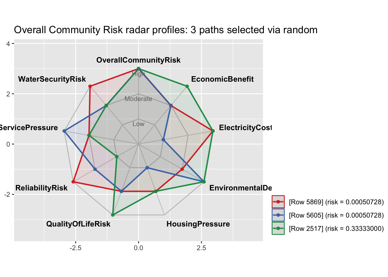
Note that these paths are samples from the distribution of risk states of Overall Community Risk. The value for a “High” state sample need not be particularly high.
Show the code
summary(high_risk_probabilities$Probability) Min. 1st Qu. Median Mean 3rd Qu. Max.
5.644e-05 5.073e-04 3.333e-01 2.859e-01 3.333e-01 9.998e-01 High Risk Scenario
In this section we alter the meta-parameters that determine the overall risk intensity in the synthetic data to produce a higher risk version of the synthetic data. The code below generates the new data and produces a summary of the risk specific nodes for the new data set. The table indicates a marked increase for the proportions of high risk among all of the risk specific nodes.
Show the code
# ================================================================
# Usage
# ================================================================
#
# A DAG named `dag` must exist first.

# Global scenario controls.
  # global_risk_shift
  # 0.00 = baseline moderate-risk scenario
  # Positive values increase risk throughout the network
  # Negative values decrease risk throughout the network

  #  parent_effect_strength
  # Controls how strongly parent risk affects child risk.
  # 1.00 is the default.

  # conditional_noise
  # Controls random variation in conditional probabilities.
  # Larger values produce less deterministic relationships.

#
synthetic_2 <- generate_synthetic_data(
  n = 5000,
  global_risk_shift = 0.20,
  parent_effect_strength = 1.00,
  conditional_noise = 0.10
)
#
# str(synthetic)
# head(synthetic)
# ================================================================

risk_nodes <- c(
  "GridStress",
  "HousingPressure",
  "ServicePressure",
  "TrafficExposure",
  "VisualLandUseExposure",
  "WaterCompetition",
  "ElectricityCostRisk",
  "QualityOfLifeRisk",
  "ReliabilityRisk",
  "WaterSecurityRisk",
  "OverallCommunityRisk"
)

risk_summary <- do.call(
  rbind,
  lapply(risk_nodes, function(node) {
    p <- prop.table(table(synthetic_2[[node]]))

    data.frame(
      Node = node,
      Low = unname(p["Low"]),
      Moderate = unname(p["Moderate"]),
      High = unname(p["High"])
    )
  })
)

risk_summary
Node Low Moderate High
1 GridStress 0.0698 0.3416 0.5886
2 HousingPressure 0.0606 0.2964 0.6430
3 ServicePressure 0.0596 0.3144 0.6260
4 TrafficExposure 0.0608 0.3348 0.6044
5 VisualLandUseExposure 0.0610 0.3366 0.6024
6 WaterCompetition 0.0598 0.3144 0.6258
7 ElectricityCostRisk 0.0732 0.3844 0.5424
8 QualityOfLifeRisk 0.0262 0.2422 0.7316
9 ReliabilityRisk 0.0556 0.2348 0.7096
10 WaterSecurityRisk 0.0748 0.3656 0.5596
11 OverallCommunityRisk 0.0194 0.1638 0.8168The next section of code fits the model to the new data displays the predicted values. As above, we use the bnlearn predict function to bootstrap predictions of risk for each of the three risk scenarios: “Low”, “Moderate”, and “High.
Show the code
# ------------------------------------------------------------
# 5. Fit the Bayesian Network
# ------------------------------------------------------------

fitted_bn_2 <- bn.fit(
  dag,
  data = synthetic_2,
  method = "bayes",
  iss = 10
)

## Inspect Overall Community Risk, or any other node directly from the object

predicted_2 <- predict(
  fitted_bn_2,
  node = "OverallCommunityRisk",
  data = synthetic_2,
  prob = TRUE
)

# 1. Extract and transpose the probability matrix
probs <- t(attr(predicted_2, "prob"))
# 2. Assign column names for clarity
colnames(probs) <- c("Low", "Moderate", "High")
# 3. Generate summary statistics (Min, 1st Qu., Median, Mean, 3rd Qu., Max)
#summary(probs)
rounded_summary <- sapply(as.data.frame(probs), summary)
rounded_summary <- round(rounded_summary, digits = 4)
rounded_summary
Low Moderate High
Min. 0.0000 0.0000 0.0003
1st Qu. 0.0000 0.0005 0.7777
Median 0.0002 0.1183 0.8767
Mean 0.0195 0.1638 0.8167
3rd Qu. 0.0068 0.2076 0.9434
Max. 0.9990 0.9995 0.9999Here we generate the density contour plot for the new risk scenario.
Show the code
#library(ggtern)

# ----------------------------------------------------------------
# 1. Ingest Your bnlearn Bootstrap Matrix
# ----------------------------------------------------------------
prob_matrix <- t(attr(predicted_2, "prob"))
colnames(prob_matrix) <- c("Low", "Moderate", "High")
df_wide <- as.data.frame(prob_matrix)

# ----------------------------------------------------------------
# 2. Modernized Ternary Contoured Density Heatmap (No Warnings)
# ----------------------------------------------------------------
plot_density <- ggtern(data = df_wide, aes(x = Low, y = High, z = Moderate)) +
  # Computes and fills a 2D density surface inside the triangular space
  stat_density_tern(
    geom  = "polygon",
    # FIXED: Replaced deprecated ..level.. with the modern after_stat(level)
    aes(fill = after_stat(level), alpha = after_stat(level)),
    n     = 200,
    bdl   = 0.01,
    # FIXED: Mutes the out-of-bounds scale range warning safely
    na.rm = TRUE
  ) +
  scale_fill_gradient(low = "#ffeda0", high = "#f03b20") +
  scale_alpha_continuous(range = c(0.4, 0.99)) +
  geom_point(alpha = 0.2, size = 0.8, color = "black") +
  theme_rgbw() +
  labs(
    title    = "Density Contour of Predicted Community Risk Profile",
    subtitle = "Heatmap showing where bootstrap predictions cluster",
    x        = "Low Risk",
    y        = "High Risk",
    z        = "Mod Risk",
    xarrow   = "Decreasing Risk",
    yarrow   = "Increasing Risk",
    zarrow   = "Increasing Risk"
  ) +
  theme(
    plot.title      = element_text(face = "bold", size = 14),
    legend.position = "none",
    tern.axis.arrow.show = TRUE
  )

plot_density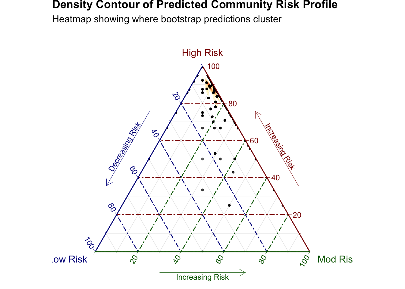
Show the code
# plot_density <- ggtern(
#   data = df_wide,
#   aes(x = Low, y = High, z = Moderate)
# ) +
#   stat_density_tern(
#     geom = "polygon",
#     aes(
#       fill = after_stat(level),
#       group = after_stat(level)
#     ),
#     n = 200,
#     bdl = 0.01,
#     na.rm = TRUE
#   ) +
#   scale_fill_gradient(
#     low = "#ffeda0",
#     high = "#f03b20"
#   ) +
#   geom_point(
#     alpha = 0.2,
#     size = 0.8,
#     color = "black"
#   ) +
#   theme_rgbw() +
#   theme(
#     plot.title = element_text(face = "bold", size = 14),
#     legend.position = "none",
#     tern.axis.arrow.show = TRUE
#   )
#
# plot_density
Summary
This post presents a model that is intended to serve as a template for building Bayesian Networks to explore the risk posed to a community from building a data center. It implements R code that includes a robust DAG, a synthetic data generator that can be customized to reflect the initial probability distributions and risk intensity settings. In a modeling effort for a particular community, these could be elicited from community experts, tables and visualizations to evaluate multiple risk states.
We human beings are notoriously bad at intuitively arriving at the correct logical conclusions to even the simplest conditional probability arguments. It is envisioned that main use of tool implemented in this post would be to help people organize their beliefs about the risks of building a data center in their community in a way that would enable them to test their assumptions and explore the probable consequences.
Next Steps
In a follow up post, I hope to be able to provide more examples of additional inferences than can be made with this model.
Appendix A: Counting Tables
The following code counts the total number of tables generated by the model.
Show the code
count_displayed_cpt_tables <- function(fitted_bn) {

  result <- lapply(
    names(fitted_bn),
    function(node_name) {

      prob <- fitted_bn[[node_name]]$prob

      if (is.null(dim(prob))) {

        # Root node: a probability vector, not a 2D table
        data.frame(
          Node = node_name,
          CPTDimensions = length(prob),
          NumberOfTables = 1L,
          stringsAsFactors = FALSE
        )

      } else {

        dimensions <- dim(prob)

        # For a 3D CPT, the printed tables are slices of the third dimension.
        # For higher-dimensional CPTs, count all slices after dimensions 1 and 2.
        number_of_tables <- if (length(dimensions) <= 2L) {
          1L
        } else {
          prod(dimensions[-c(1, 2)])
        }

        data.frame(
          Node = node_name,
          CPTDimensions = paste(dimensions, collapse = " x "),
          NumberOfTables = number_of_tables,
          stringsAsFactors = FALSE
        )
      }
    }
  )

  result <- do.call(rbind, result)
  rownames(result) <- NULL

  result
}

cpt_table_counts <- count_displayed_cpt_tables(fitted_bn)

cpt_table_counts
Node CPTDimensions NumberOfTables
1 AccessToBenefits 3 x 6 x 4 4
2 AirQualityExposure 3 x 3 x 6 x 4 24
3 BackupGeneration 3 x 4 1
4 ConstructionIntensity 3 x 4 1
5 Cooling 4 1
6 Distance 6 1
7 EconomicBenefit 3 x 3 x 4 4
8 ElectricityCostRisk 3 x 6 x 3 3
9 ElectricityDemand 4 x 4 1
10 EnvironmentalDegradation 3 x 3 x 3 x 3 9
11 GridCapacity 3 1
12 GridStress 3 x 4 x 3 3
13 HousingAvailability 3 1
14 HousingPressure 3 x 3 x 3 3
15 LandFootprint 3 x 4 1
16 NoiseExposure 3 x 4 x 6 x 4 24
17 OverallCommunityRisk 3 x 3 x 3 x 3 x 3 x 3 x 3 x 3 x 3 2187
18 QualityOfLifeRisk 3 x 3 x 3 x 3 x 3 x 3 x 3 243
19 ReliabilityRisk 3 x 3 1
20 Scale 4 1
21 ServicePressure 3 x 3 x 3 3
22 TrafficExposure 3 x 3 x 6 6
23 VisualLandUseExposure 3 x 6 x 3 3
24 Vulnerability 3 1
25 WaterAvailability 3 1
26 WaterCompetition 3 x 3 x 3 3
27 WaterDemand 3 x 4 x 4 4
28 WaterSecurityRisk 3 x 3 x 3 3
29 WorkforceDemand 3 x 4 1Show the code
tot_tables <- sum(cpt_table_counts$NumberOfTables)Altogether, the this model produces a total of 2539 tables.
Appendix B: The Laplacian Radial Kernel
This code plots the Laplacian radial kernel used to set risk for derived, non-root nodes in the algorithm to generate synthetic data.
\[P_{\text{raw}}(\text{state}) = e^{-c \cdot \vert{}\text{State Score} - \text{Target Risk}\vert{}}\] across our three standard derived states (Low = 0.15, Moderate = 0.50, High = 0.85). It dynamically plots how the final normalized probabilities shift as the calculated Target Risk moves from 0.00 to 1.00.
Child-state probabilities were generated using normalized exponential distance weights. For each state, the weight was defined as above where \(\vert{}\text{State Score} = r_s\) is the predefined risk score for state s. \(\vert{}\text{TargetRisk}\) is the parent-dependent target risk, and c controls concentration around the target. This is equivalent to applying a one-dimensional exponential, or Laplacian, radial kernel centered at \(\vert{}\text{TargetRisk}\), followed by normalization across child states.
Show the code
# ----------------------------------------------------------------
# 1. Define Core Simulation Parameters
# ----------------------------------------------------------------
concentration <- 6
state_scores  <- c(Low = 0.15, Moderate = 0.50, High = 0.85)
target_range  <- seq(0.00, 1.00, by = 0.01)

# ----------------------------------------------------------------
# 2. Compute Normalized Probabilities over Target Risk Continuum
# ----------------------------------------------------------------
plot_data <- data.frame()

for (target_risk in target_range) {
  # Step 3: Measure raw exponential distances
  raw_probs <- exp(-concentration * abs(state_scores - target_risk))

  # Step 4: Normalize scores to sum to 1.00
  final_probs <- raw_probs / sum(raw_probs)

  # Bind results for plotting
  row_df <- data.frame(
    TargetRisk = target_risk,
    Low        = final_probs["Low"],
    Moderate   = final_probs["Moderate"],
    High       = final_probs["High"]
  )
  plot_data <- rbind(plot_data, row_df)
}

# Pivot data into a long format optimized for ggplot2 tracking
plot_data_long <- pivot_longer(
  plot_data,
  cols      = c("Low", "Moderate", "High"),
  names_to  = "State",
  values_to = "Probability"
)

# Enforce clean factor ordering matching the network architecture
plot_data_long$State <- factor(plot_data_long$State, levels = c("Low", "Moderate", "High"))

# ----------------------------------------------------------------
# 3. Generate the RMarkdown Visualization
# ----------------------------------------------------------------
ggplot(plot_data_long, aes(x = TargetRisk, y = Probability, color = State)) +
  geom_line(size = 1.2) +
  # Visual reference lines matching the static state risk mappings
  geom_vline(xintercept = c(0.15, 0.50, 0.85), linetype = "dashed", color = "gray60", alpha = 0.7) +
  scale_color_manual(values = c("Low" = "#2b8cbe", "Moderate" = "#feb24c", "High" = "#f03b20")) +
  labs(
    title    = "Dynamic Probability Shifts for Derived Non-Root Nodes",
    subtitle = paste0("Exponential RBF Kernel Behavior (Concentration = ", concentration, ")"),
    x        = "Calculated Target Risk Score (From Parents + Noise)",
    y        = "Final State Generation Probability",
    color    = "Assigned State"
  ) +
  scale_x_continuous(breaks = seq(0, 1, 0.1)) +
scale_y_continuous(labels = scales::percent_format(accuracy = 1)) 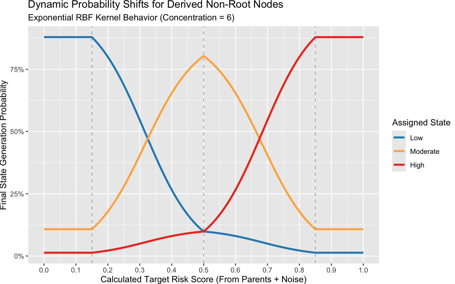
Show the code
  #theme_minimal(base_size = 12) +
  # theme(
  #   plot.title         = element_text(face = "bold", linewidth = 1),
  #   panel.grid.minor   = element_blank(),
  #   legend.position    = "bottom"
  #)
Appendix C: Some Documentation on Data Center Risks
This section provides some references, mostly investigative reports, that support the general risk categories used in the model.
Electricity, Grid Reliability, and Affordability
Earthjustice reports that the traditional utility model socializes grid infrastructure costs across the entire customer base. When utilities race to build new substations, gas power plants, and transmission lines for tech facilities, standard ratepayers often absorb those costs.
CEPR economic analysis found that adding a single average hyperscale facility increases local residential power prices by roughly 4%, while adding ten facilities spikes residential rates by 13%.
Brookings Institution research warns that rapid large-load data center growth is decoupling electricity bills from baseline inflation, compounding utility disconnection rates in high-density clusters like Northern Virginia. Nuance/Counter-Perspective: A working paper
Water Resource Demands
A hydrologist report from North Carolina State University sates that data centers rely heavily on “open-loop evaporative cooling” systems that consume water and release it as vapor instead of returning it to the local system. Emphasizing that because data center demand “never sleeps,” it permanently removes millions of gallons daily and alters the baseline natural water balance of watersheds.
Ceres Sustainability Report predicts that “in the coming years, annual water use associated with data center electricity consumption is expected to increase by 400%, from an estimated 2.9 billion gallons to over 14.5 billion gallons – enough to supply the entire city of Scottsdale, Ariz. for over 2 years and that increases regional water stress by up to 17% annually in already strained basins.
The Next 10 report: The Intersection of Data Center Development, Water Availability, and Environmental Justice in California discusses the potential impact of data centers to California communities that are suffering water shortages and concludes among its top 1 findings that: “Water scarcity impacts extend beyond the footprint of any single data center, particularly when facilities rely on imported water or shared groundwater basins”
Land and Housing
According to the report From Energy Use to Air Quality, the Many Ways Data Centers Affect US Communities a national evaluation by the World Resources Institute (WRI), the average footprint of a modern data center footprint spans approximately 224 acres (roughly 450 football fields). Data centers often encroach into rural-zoned lands or agricultural areas.
The Brookings Institute report New evidence on data center employment effects claims that wages are unaffected by data center builds while home prices rise 2%-5%.
Noise and Air Quality and Environmental Polution
An investigative report by The Guardian exposed instances where tech developers skirted stringent clean air regulations by splitting massive facility configurations into multiple “minor” emission sources on paper to fast-track permitting.
The IEEE Report We Need to Talk About AI’s Impact on Public Health Data-center pollution is linked to asthma, heart attacks, and more outlines a number of way that data centers adversely affect public health. For example, data center backup generators run on diesel fuel and emit 200 to 600 times more nitrogen oxides than an equivalent natural gas power plant.
The December 2024 report issued by the Virginia Joint Legislative Audit and Review Commission (JLARC), Data Centers in Virginia (Report 598) found that:
- about one-third of operational data center properties in Virginia sit within 200 feet of residential zoned properties.
- data centers emit a continuous, low-frequency hum generated by around-the-clock cooling infrastructure, HVAC systems, and mechanical fans. Because low-frequency sound waves travel further and penetrate residential structures more efficiently than higher-frequency sounds, they frequently trigger complaints regarding well-being and disrupted sleep patterns from nearby families
Governance and Fairness
The World Resources Institute Report cited above Using the Centers for Disease Control’s (CDC) Environmental Justice Index, the World Resources Institute proved that a disproportionate percentage of data center developments cluster in census tracts that suffer from above-median pre-existing environmental vulnerabilities (such as high baseline air pollution) and social vulnerabilities (such as lower average education and higher poverty rates).